
Nest – Student Group Finder App
UX Research and Design
Nest is an all-in-one group forming platform. Nest gives students a fun way to introduce themselves to other students and get to know their unique traits and schedules. The platform will then help students match and form groups for their academic projects through various tools such as a group chat messaging and scheduling a meeting. The project was created for The Innovation Hub through the ‘Fundamentals of UX’ course at the University of Toronto.
This project involved user research into the potential demographic of common university students and the creation of a low-to-medium fidelity design prototype.
Role
UX Designer and researcher
Tools
Figma and Maze
Team Members
Jonathan Ho, Erxun Tan, Emily Wong, Vitak Kam, Junjie Huang, Skyler Huang
Timeline
3 months (Oct 2021 to Dec 2021)
The Problem
Following the COVID-19 pandemic and the re-opening of in-person activities, our team wanted to explore ways to help students transition back to a physical setting by exploring common problems faced by University of Toronto students. One that particularly caught our interest was the process of student group formation for academic projects and assignments as this was a common pattern that was encountered in various classes within the university.
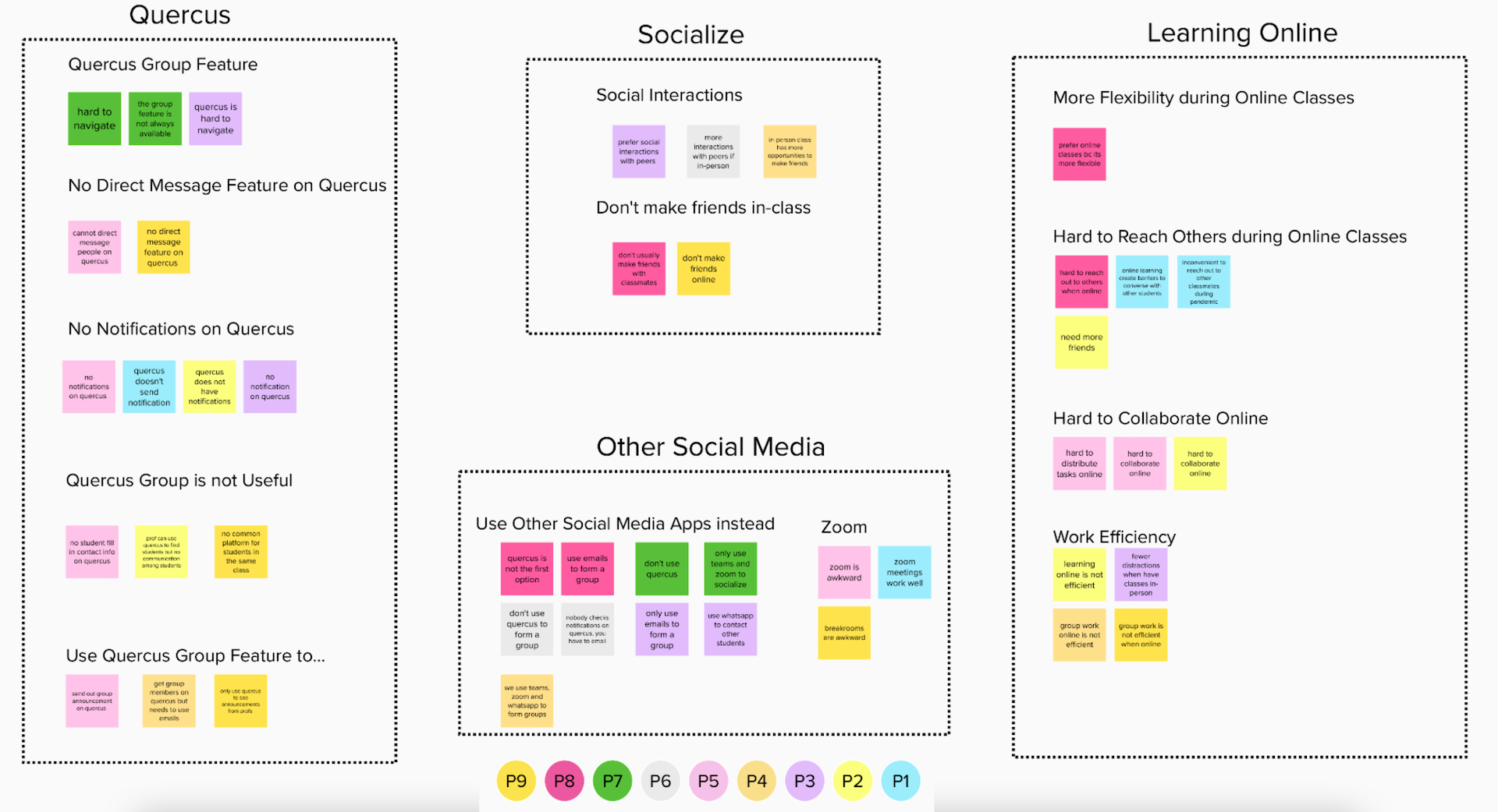
We surveyed 411 University of Toronto students and conducted 9 interviews to understand their process, difficulties and pain points around forming a group for academic assessments to design a solution for improving the group formation experience.
From our preliminary user research, we found:
- 173 of 411 students mentioned their biggest challenge was “Finding People”
- 59 and 56 students mentioned they don’t know other students from the class and struggled about the method to use to reach out to others respectively
- With remote learning due to the COVID-19 pandemic, students found more limitations to socialization and communication than in-person learning
- Major concerns shared regarding the group formation process and the functions and limitations of using the university’s learning management tool to form and communicate with the group.
We took our findings and compiled and grouped the results into various themes on our affinity diagram.
So how might students connect with other students prior to creating a group for academic projects and finding compatible group members?
User Needs Analysis
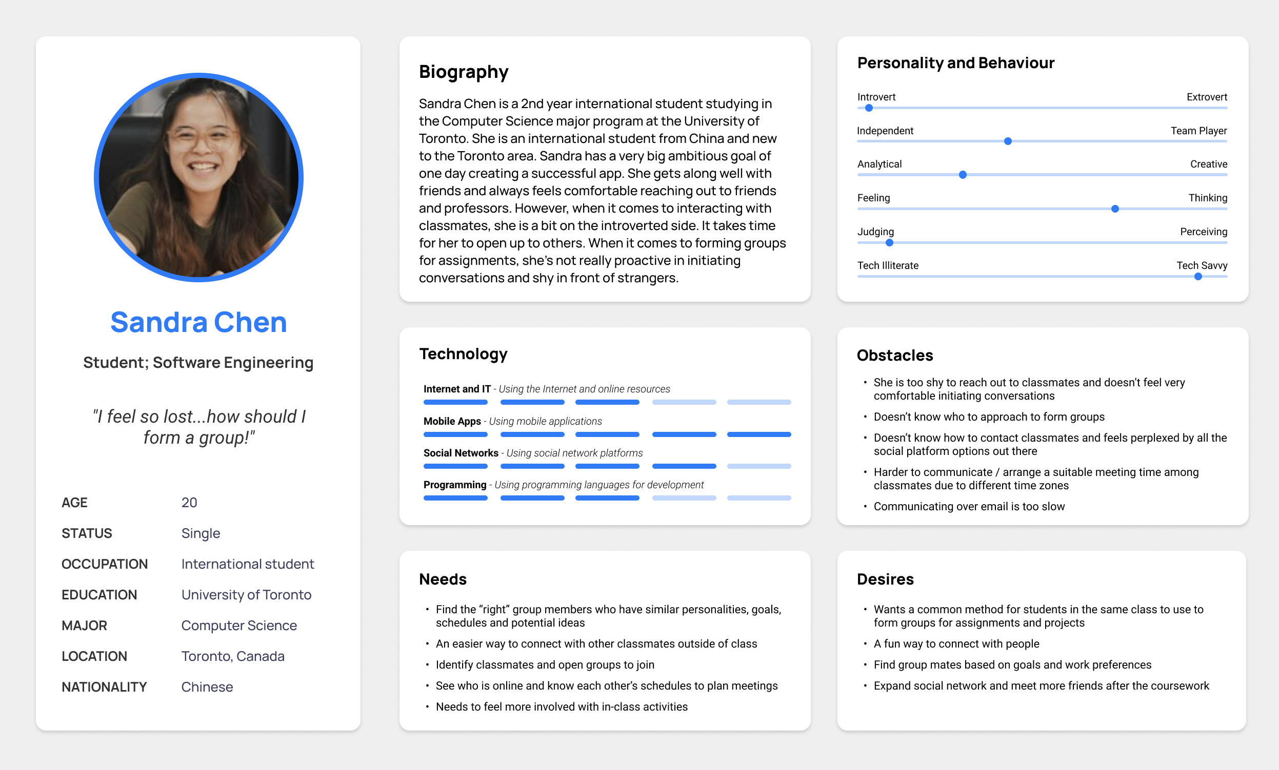
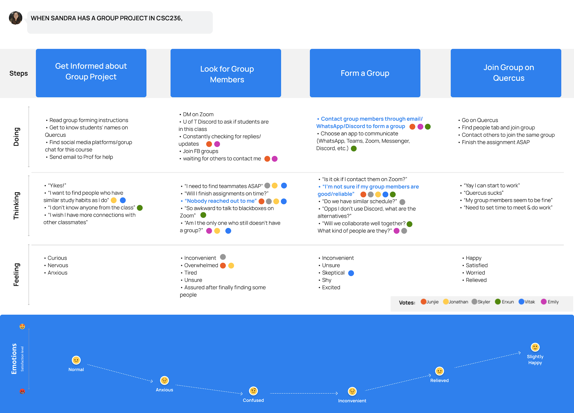
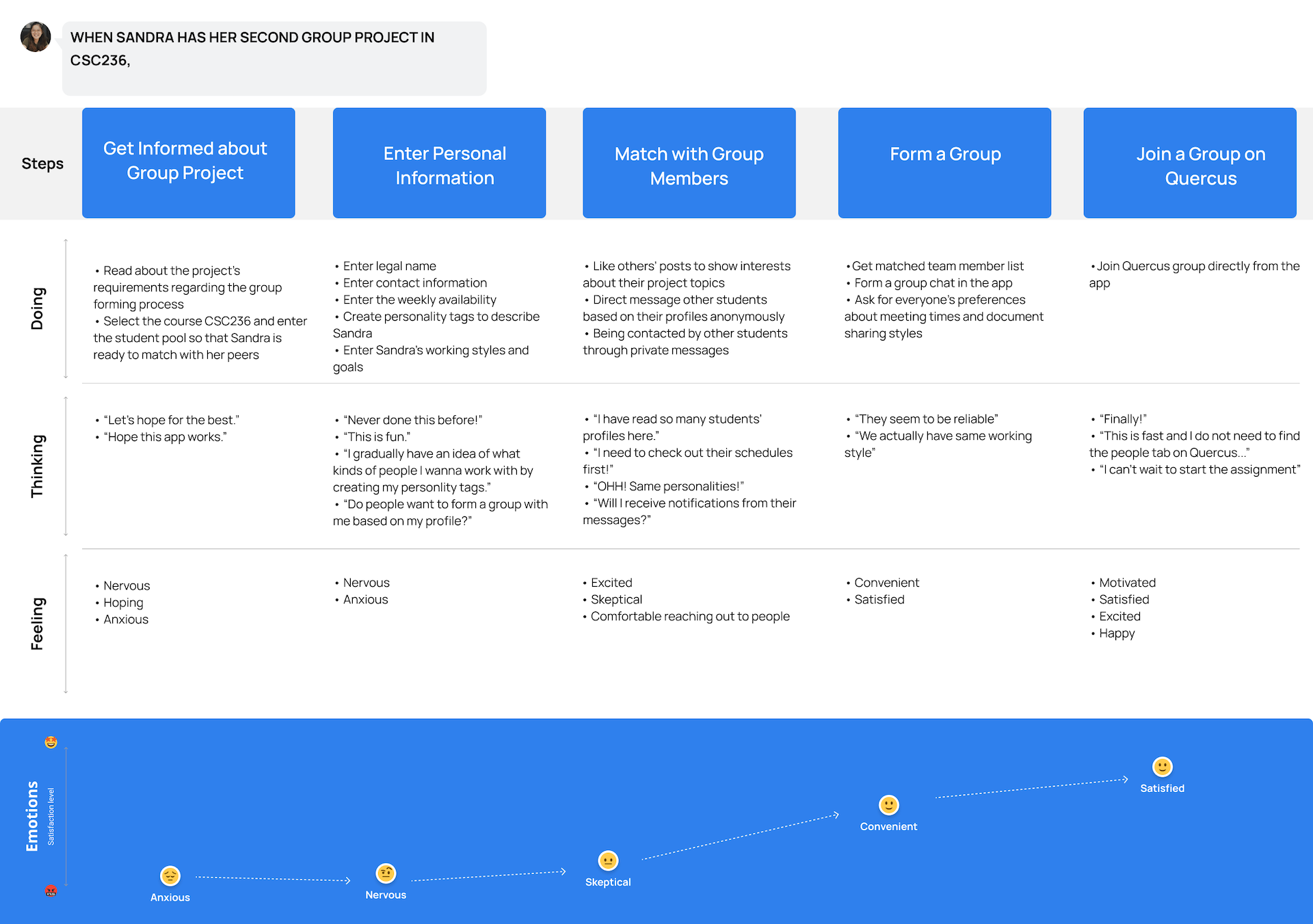
Meet our persona Sandra, a 2nd year international student studying Computer Science. By looking at Sandra’s profile and her journey with the current system, we can help better understand and identify our users’ needs and pain points when using existing solutions.
Designing Requirements
We concluded Sandra’s needs from our research data and persona.
- Sandra needs a way to better understand her classmates so that she can find compatible group members.
- Sandra needs a way to connect with her classmates so that she won’t be awkward to reach out to them.
- Sandra needs a way to get notifications from other students so that she saves time waiting for responses.
- Sandra needs a way to find out the schedule of each potential group member so that she can better collaborate with the future group.
- Sandra needs a way to communicate with group members so that she does not have to contact group members using multiple apps.
We generated 20 big ideas including 3 absurd ideas. We then ranked each idea based on its feasibility (can be implemented) and impact (solves Sandra’s pain points) and used a prioritization grid to show our “Home Runs” and “Big Bets”.
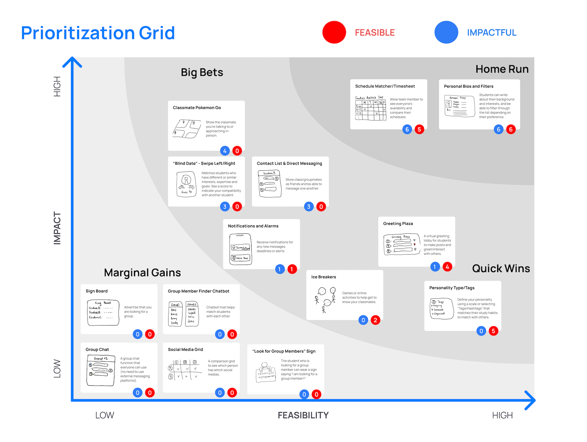
Two ideas that were our home runs are Schedule Matcher/Timesheet and Personal Bios and Filters. With our voted ideas, we determined Sandra’s prospective journey will be after we have designed our proposed solution.
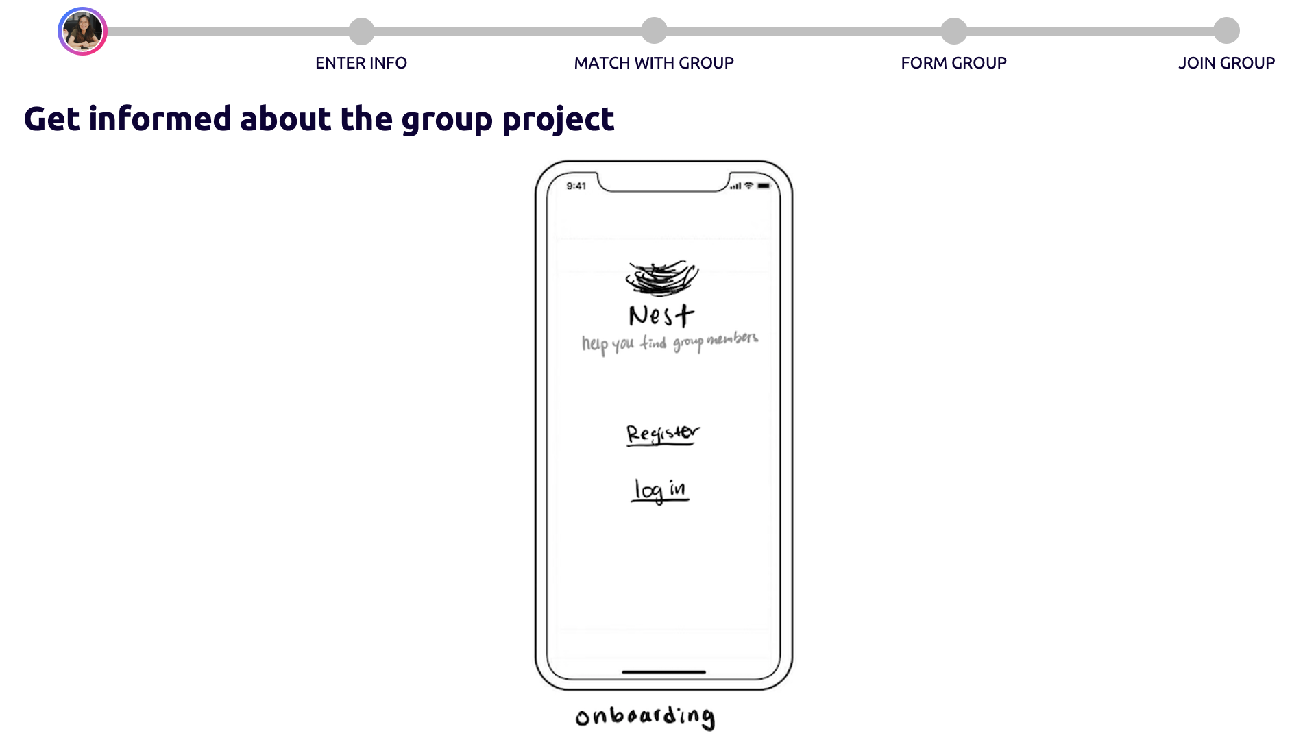
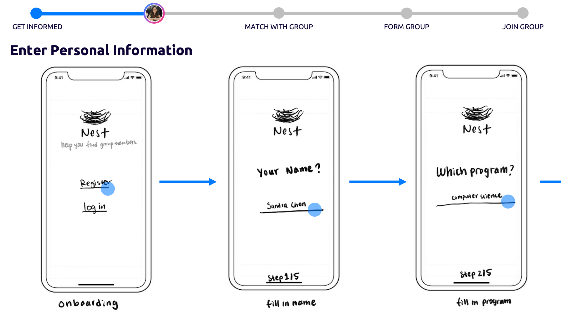
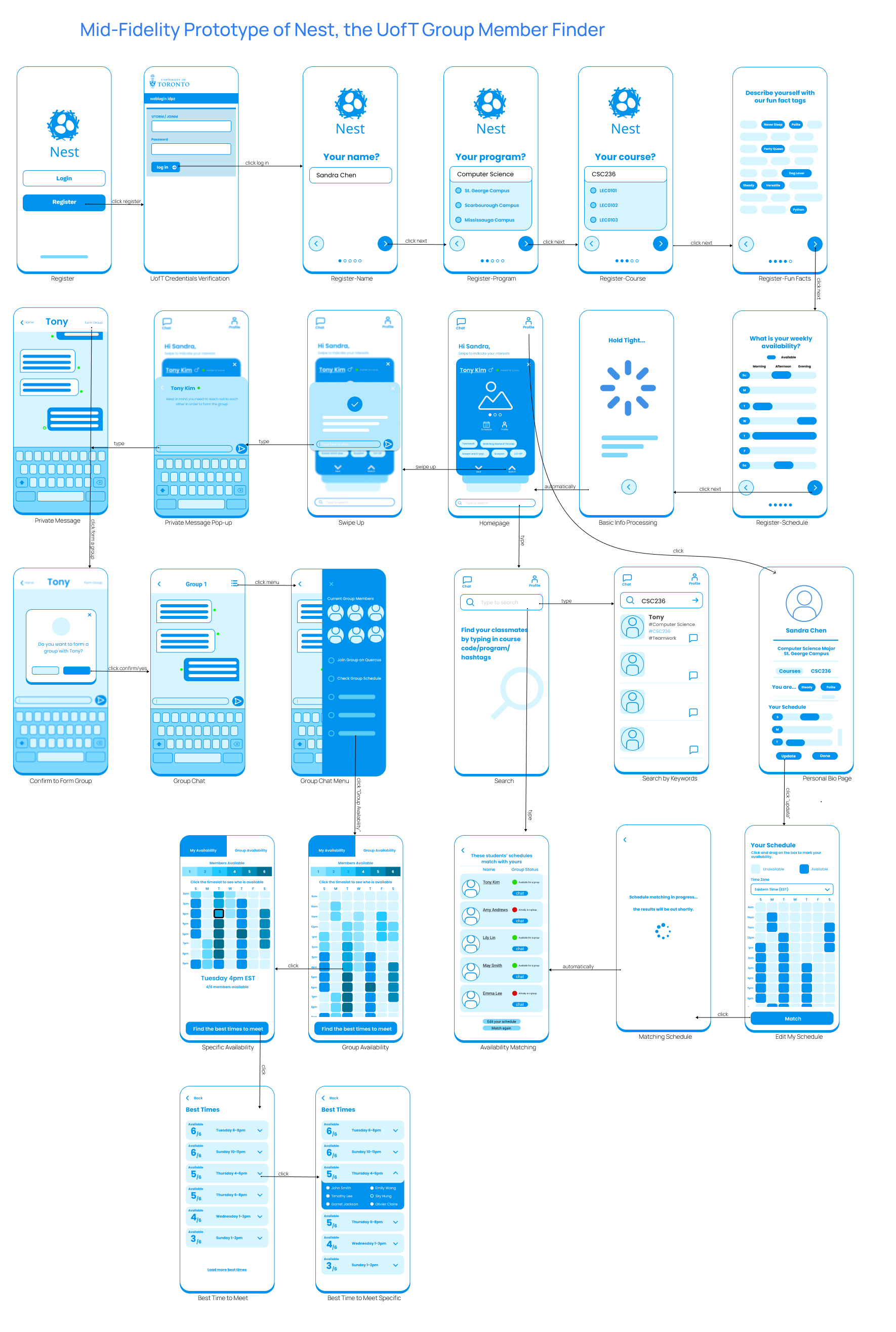
Design and Prototype
For our prototype, we primarily focused on fulfilling 3 statements (hills) which describes who is impacted, what they are impacted by, and the wow factor to tie it all together.
- A student who has a group project can find other students with similar schedules on the same day the professor announces the project.
- A student looking for a group can find and reach out to classmates using a singular communication channel.
- A student looking for a group can know more about their classmates’ working styles without previously working with them.
The hill statements help us identify the core functions our solution will need:
- How to find students with similar schedules
- A singular communication channel
- To understand other students’ working styles
We conducted a lean evaluation with 3 students at the University of Toronto to see how intuitive our low-fidelity designs were and to discover items that needed to be approved for our medium fidelity prototype.
Evaluation
- Asynchronous observations – We asked our users to complete a 3 tasks and observed their efficiency completing their task and their interactions
- Interviews – We asked post-interview questions to examine their thoughts on the usability of the prototype
From our evaluations, of the 61 students that participated, we found that:
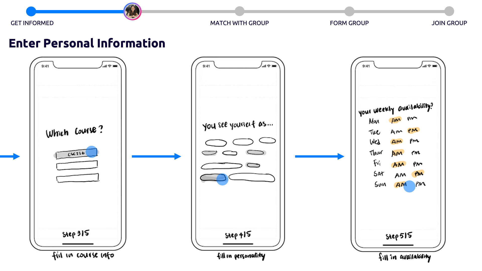
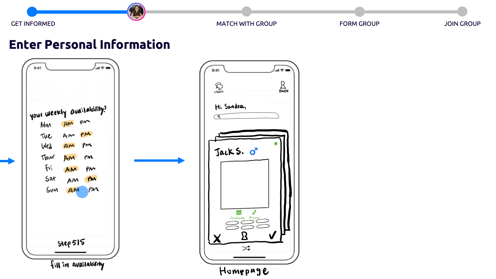
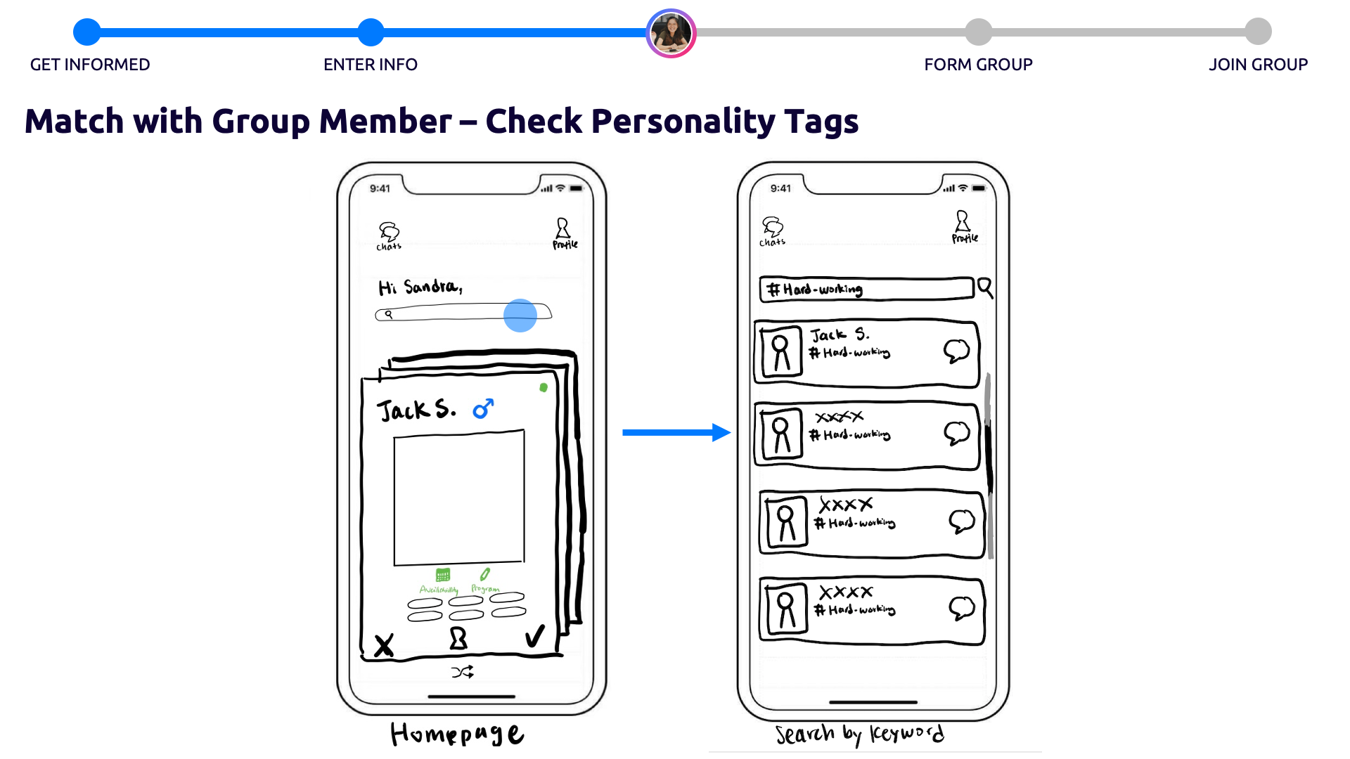
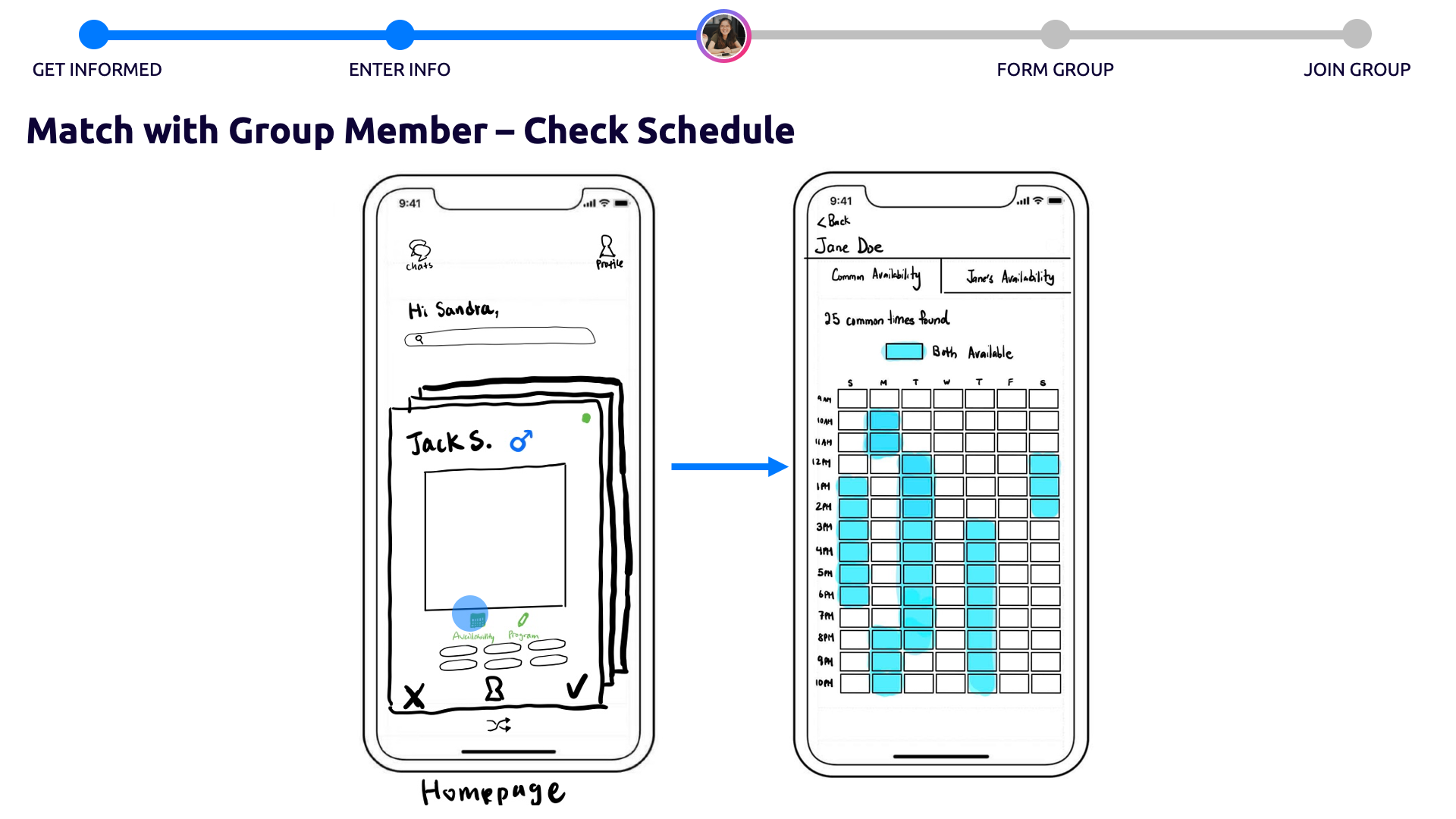
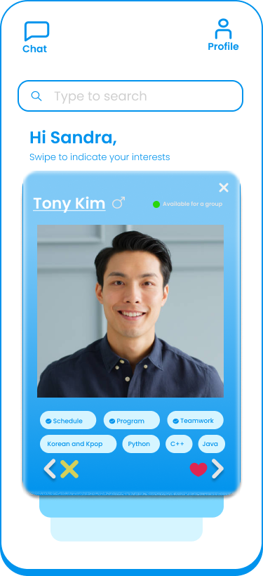
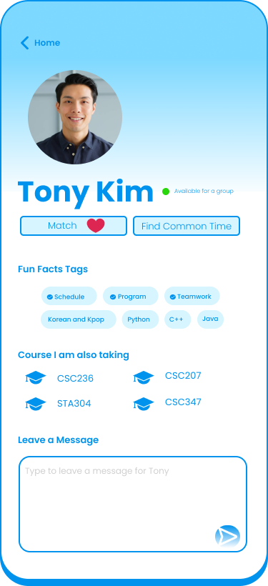
Search for CSC236 classmates using search bar and check student’s schedule
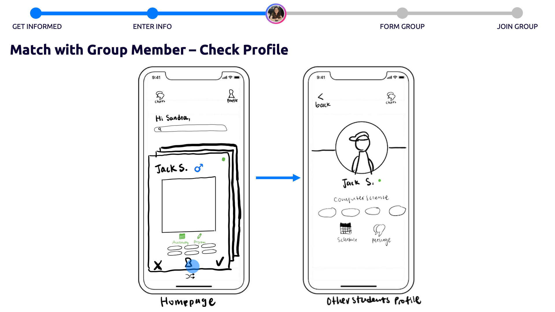
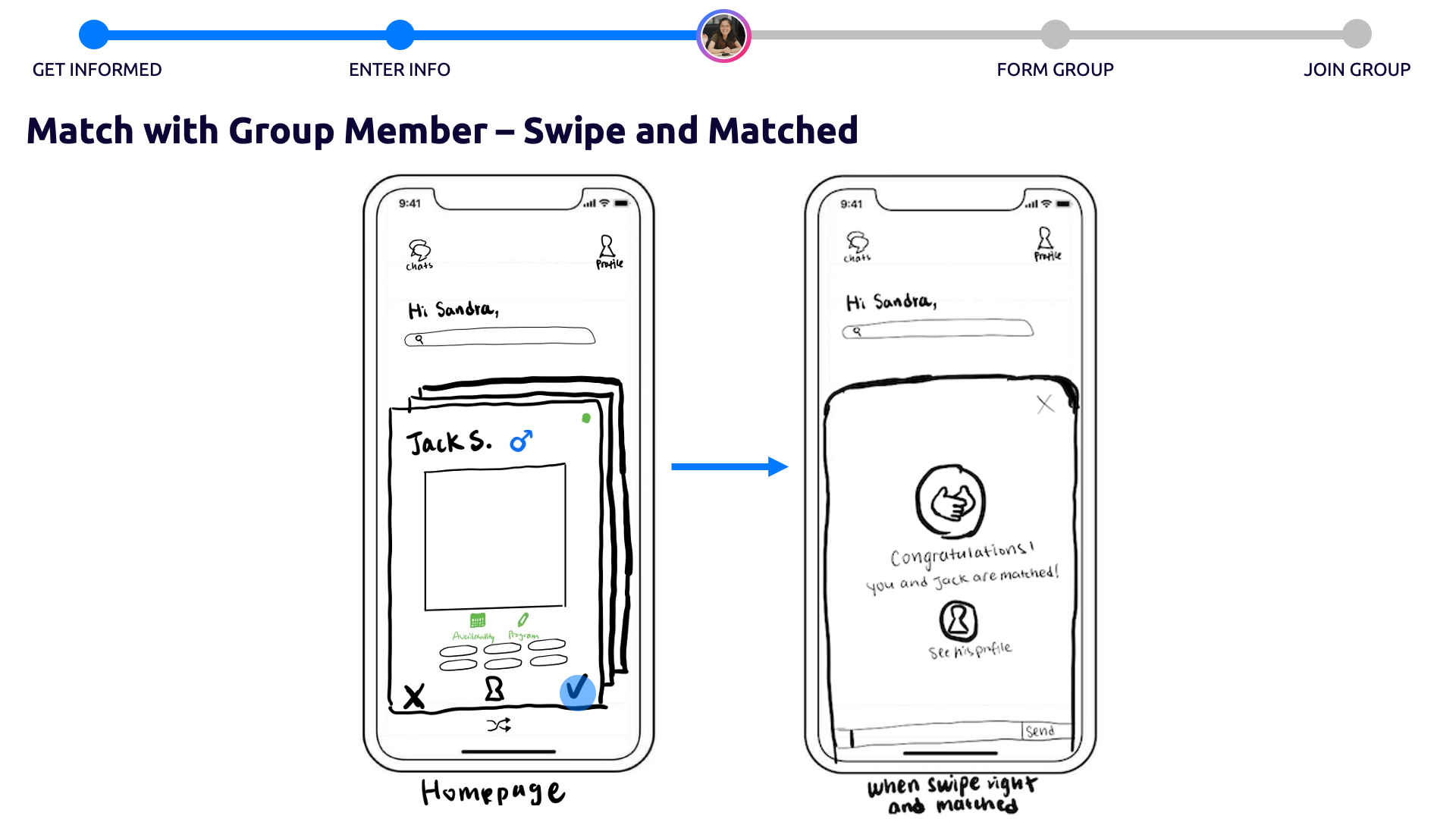
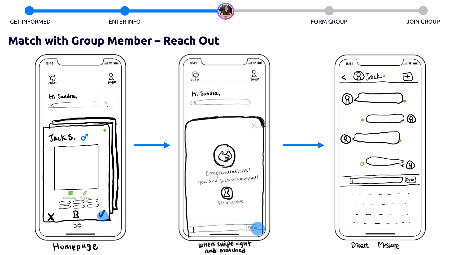
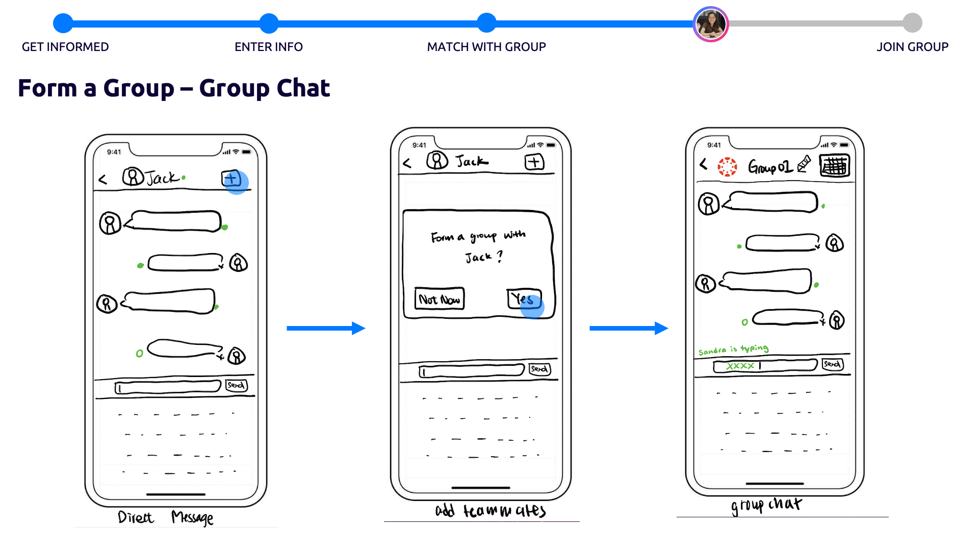
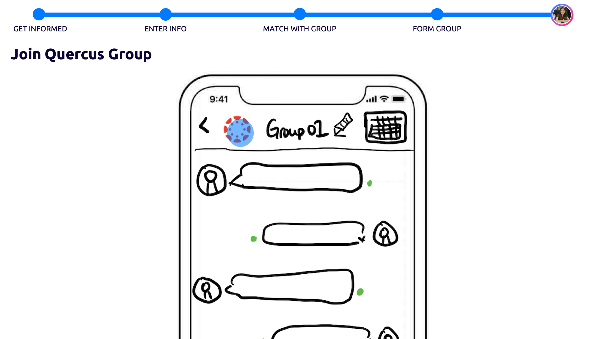
Match with student, send a message, then form a group
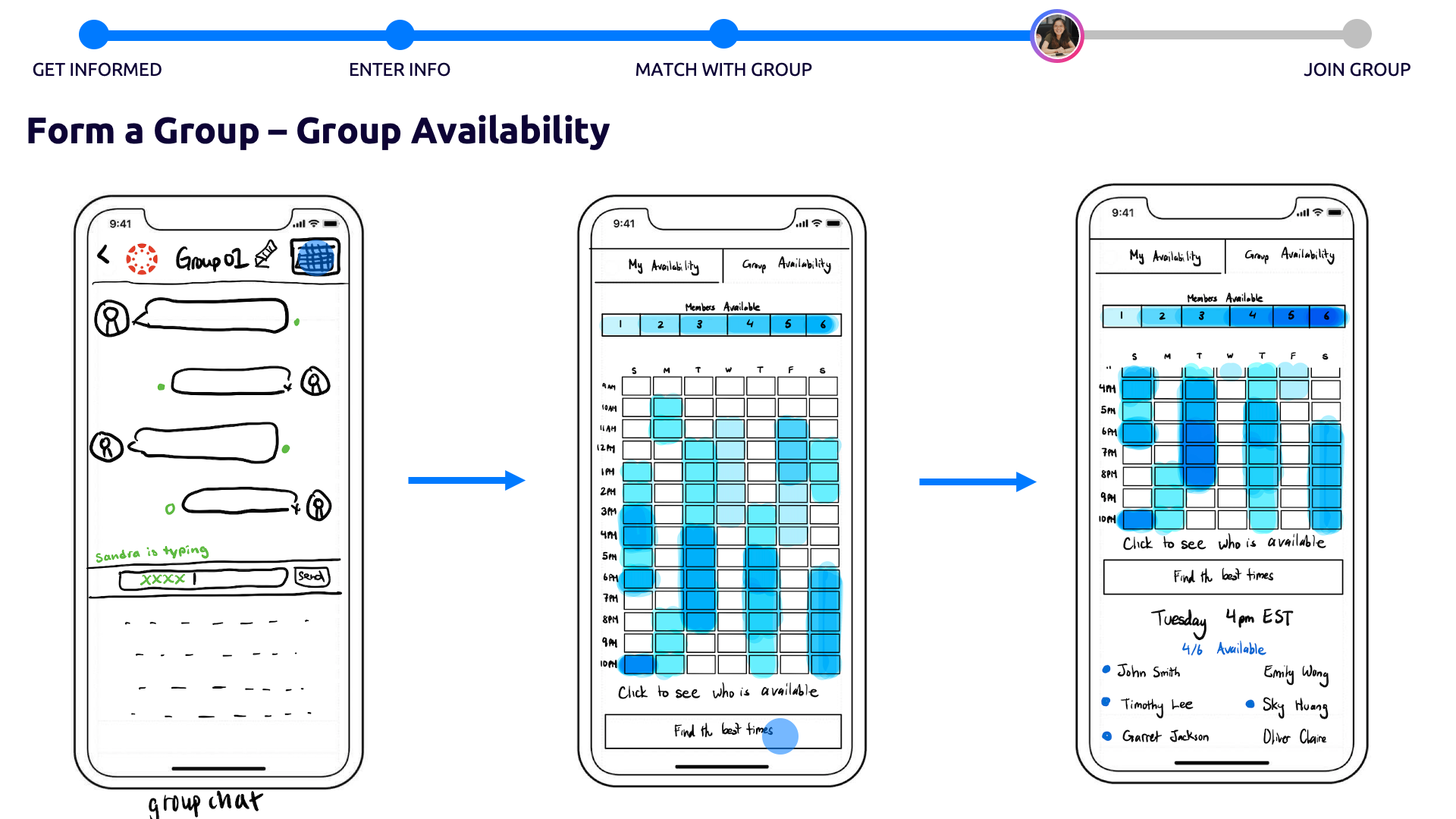
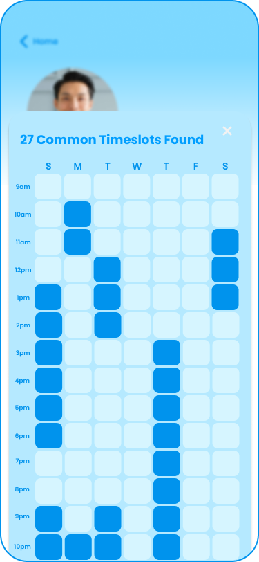
Check group availabilities and use “Find the Best Time to Meet”
Feedback we’ve received from our prototype:
“The schedule-matching is the best part of the app!”
“It will be better if it can be linked to Outlook or Google Calendar.”
“Where is the search bar? It’s hard to notice it!”
“Some of the icons are intuitive but some are also a bit confusing on what they mean”
Next Steps
Our next step includes:
- Continue working on the high-fidelity prototype
- Modify – Modify critical screens that require reworking
- Conduct a usability testing for our high-fidelity prototype and assess using the 10 usability heuristics
Lessons Learned and Reflection
- The order DOES matter.
Content ordering matters when it comes to presenting information and functions to users. For example, when we first designed the search bar, we put the search in the bottom and assumed users would find where the search bar is; however, with lots of things going on in their minds at the same time, users might encounter a huge cognitive workload when interacting the system, so the order of the sections and labels really matters, and users will not bother taking more time to find stuff; instead, they will say they cannot find it. - Many unexpected paths of user interactions.
Edge cases should all be considered, since users might go to some unexpected paths in order to complete the tasks, so a good system should be able to lead users to the 3. - Solutions may not work with everyone.
We should consider alternatives in design especially for accessibility reasons. It is important to continuously provide the very best and inclusive user experience for everyone.