COVID-19 Passbook
UI/UX, Visual Design
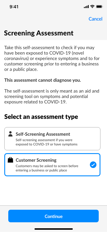
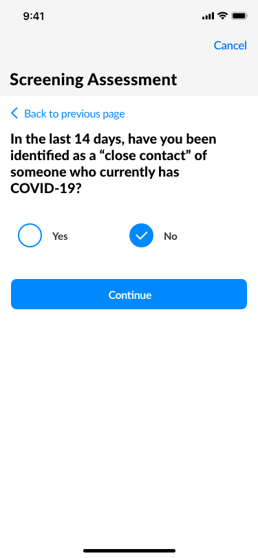
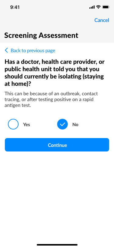
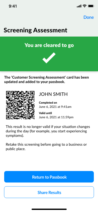
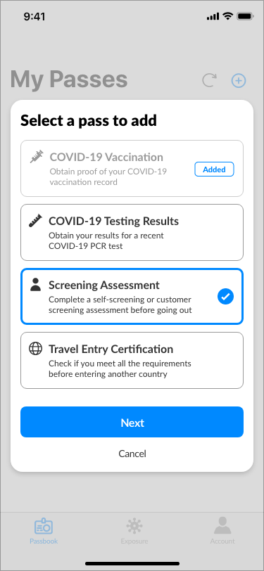
COVID-19 Passbook is a mobile app that allows users to track their COVID-19 records and let users and businesses verify valid records (such as vaccinations, tests and certifications) without extensive documentation and the use of multiple third-party apps and services. The mobile app allows users to add information cards, check for potential COVID-19 exposures and provide an easy method for businesses to verify your approved records. The project included a user research session to obtain insights and empathize with users, creating paper and digital wireframes to conduct a usability testing session, and designing a high-fidelity mock up and mobile app prototype.
The project was created as part of the Google UX Design Specialization Program.
Role
UX Designer
Course
Design a User Experience for Social Good
(Google UX Design Specialization Program)
Resources Used
Adobe Xd
Timeline
1 week (June 2021)
Overview
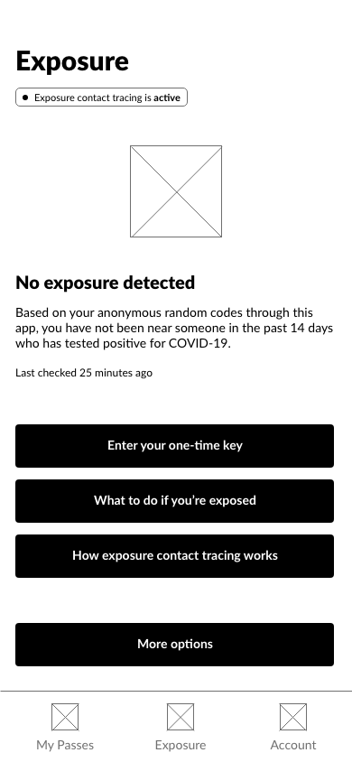
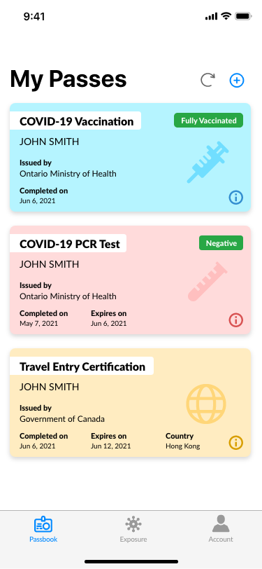
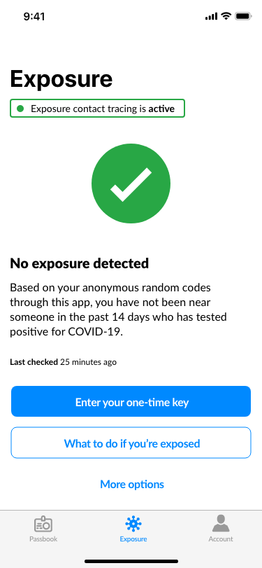
COVID-19 Passbook is a mobile app that allows users to track their COVID-19 related records and allows users and businesses to verify valid records without the need of extensive documentation. The platform allows users to add different passes into their ‘Passbook’ which includes their vaccination information, COVID-19 PCR testing and also enables exposure alerts which uses Apple’s and Google’s Exposure API notifications and Bluetooth to detect whether the user has been in close contact with someone who have reported a positive COVID-19 diagnosis.
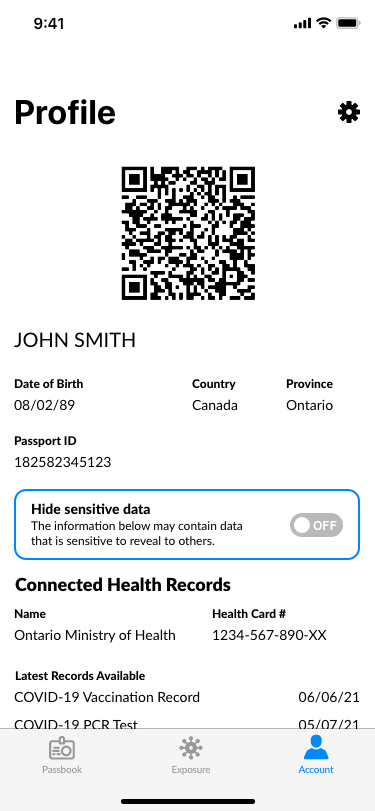
COVID-19 Passbook is designed to provide transparency and clarity into your records while protecting users of sensitive data and privacy by allowing users to show/hide certain data from public view and QR codes for verification.
Target User
Research
During the COVID-19 pandemic, one may obtain many records pertaining to COVID-19 including but not limited to vaccinations, exposure testing, travel certifications and screening. However, there are many apps and services users may use to view these records including government-approved apps, emails and hospital websites. With the use of a COVID-19 passport potentially being discussed and used, especially for international travel, users wanted to have a centralized place to store, view and verify records whenever needed. Users also wanted the ability to only show relevant information and hide sensitive information if needed.
Following an initial user research and feedback received from the users, we incorporated our findings into relevant a user persona that matches the key demographic user for our COVID-19 Passbook product

Joshua Lee
27 | Toronto, Ontario
Full-Time Software Engineer
Single, Lives with a roommate
Bio
Joshua, is a 27-year old full-time employee who loves to head out, shop and travel. He also has a interest in trying new technologies that help benefit a greater society. With COVID-19 restrictions easing due to the rise of vaccination rates, Joshua is beginning to head out again to try new patios, shop at local stores and make plans to travel abroad.
Personality/Interests
- Introverted
- Outgoing
- Goal-oriented
- Discovering and using new technologies
- Traveling/Exploring
Goals
- Minimize the time spent completing COVID screening tests for retail stores and restaurants
- Have all his COVID-19-related documentation and information displayed and accessible in one place
- Convenient to use and easy to access anytime
Frustrations
- Completing a new screening test every time
- Using multiple apps to pull different COVID-19 related documentation/information (ie. government website, email, screenshots etc.)
- Unable to share data without compromising privacy
Design Ideation
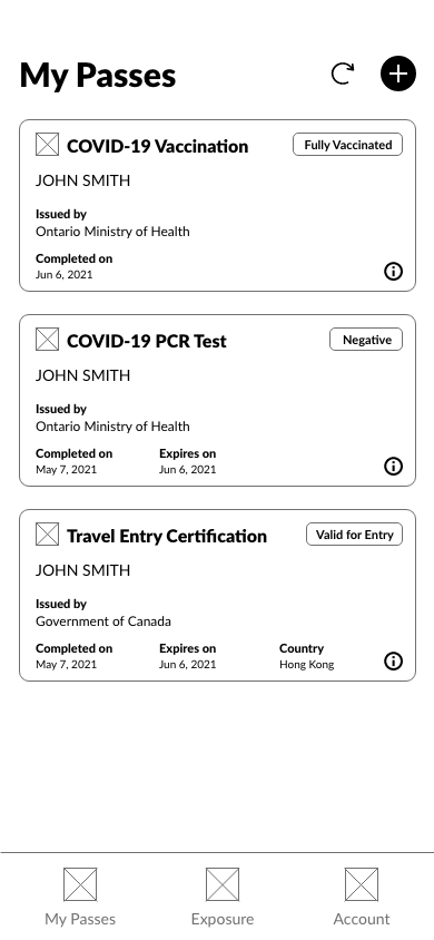
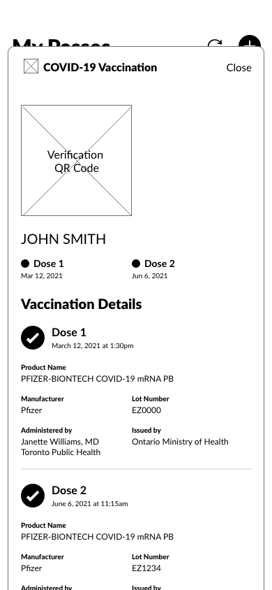
The feedback gathered from our research was analyzed and I uncovered themes that provide insight to what users wanted and emphasizes with the users. From the research, users wanted a way to display and list records that they possess such as vaccinations, testing results and any COVID-related certifications. Furthermore, users wanted the ability to view more details of the record directly from the app, as well as have access to the exposure alerts and a profile that contains their identifying information. Users also wanted the ability to hide certain sensitive data when needed and a simple way for businesses to verify/validate their records (ie. QR codes).
We put together initial ideas in the form of wireframes. After further consultation of our design, we then moved to creating low and high-fidelity mockups and prototypes.
Wireframes and Low-Fidelity
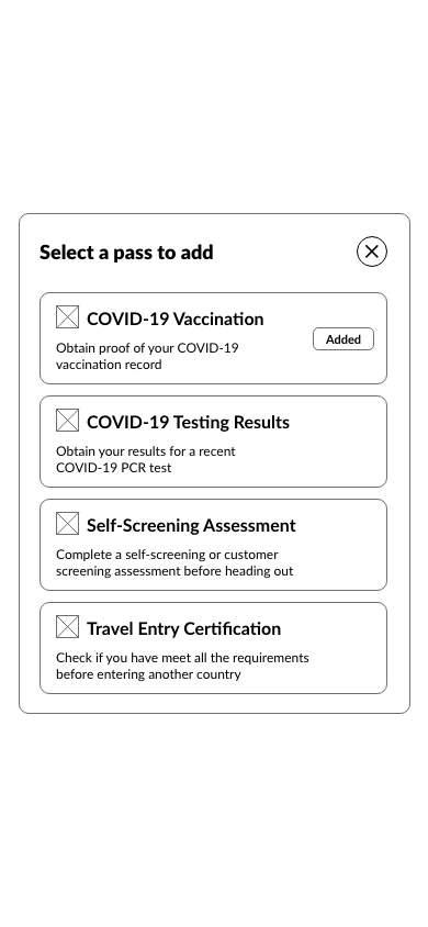
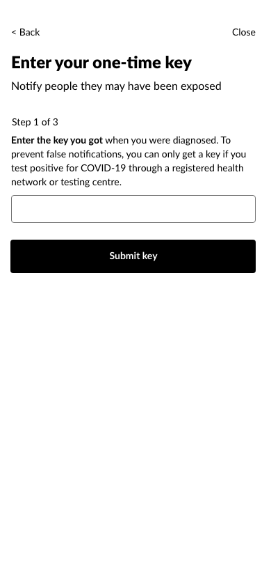
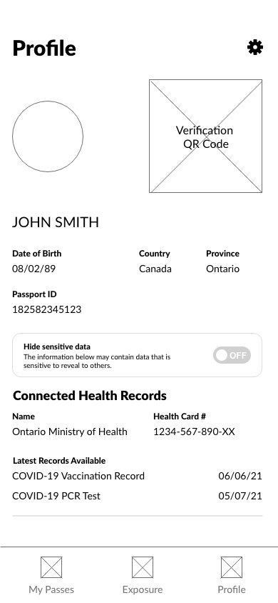
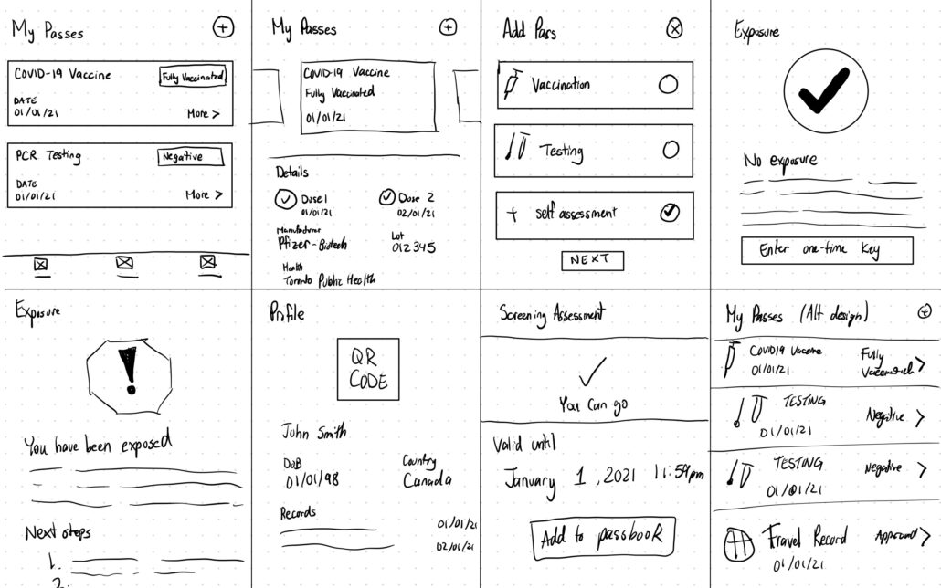
The wireframe below shows a sample of various screens including the passbook, exposure alert and profile pages designed based on what we know about the user and their needs with the system. Each main screen has a large heading that clearly indicates which screen the user is on as well as any relevant action buttons to help navigate around the app. Additionally, I try to balance the content on the screen by ensuring there is sufficient spacing between each block of text and fields.
In our low-fidelity prototype, the digital wireframes created were connected together with simple interaction rules to make it into a working prototype. Users were able to interact with the design and obtain a general idea on how the app works. Below you will find a link to my low-fidelity prototype.
Usability Study
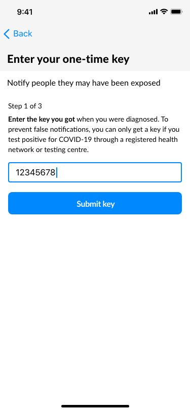
The goal of the research was to uncover any difficulties users encountered with the app’s design and interactions when completing various tasks using the COVID-19 Passbook app such as checking the details of a pass, checking for potential exposures and entering a one-time exposure key. We conducted a remote, unmoderated study between June 4-6 with 4 participants within the 18-30 age range and used their smartphone device on a regular basis.
Participants were selected based on their experiences with using COVID-19 passport related applications or utilizing multiple applications to store and retrieve their records and documentation related to COVID-19 including PCR testing and vaccinations. The participant selection was also based on users who had and also had not have experience using the screening tools provided by the Government of Ontario
REFERENCE: https://covid-19.ontario.ca/screening/customer/
REFERENCE: https://covid-19.ontario.ca/self-assessment/
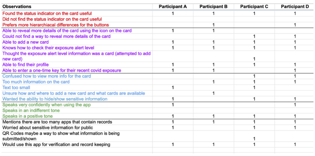
We presented participants with a series of tasks that had them interact with the core functionalities and pages within the app. They then had to complete a system usability scale to measure their experience in terms of usability. Sessions were recorded and notes were taken on their progress and feedback as shown in the spreadsheet below.
Usability Study Insights
Based on the data from the study, we identified a few insights to be addressed and organized them based on priority.
Priority 0
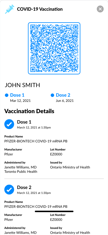
- Based on the theme that: for most users, they found the card details to be too cluttered, an insight is: more spacing is needed and only show essential info on the card and hide nonessential details.
- Based on the theme that: most users were unsure how and where to add a card and what cards they can add, an insight is: have a singular place to add cards and list out the types of cards they can add
Priority 1
- Based on the theme that: some information displayed may be sensitive when viewed by others, an insight is: provide an option to hide sensitive data from public view.
- Based on the theme that: users can’t tell if there’s a hierarchical difference for buttons, an insight is: differentiate the importance of the different buon options by using primary and secondary styles.
Priority 2
- Based on the theme that: the 3 dot more info icon is not clear for users, an insight is: change the icon to better represent more information.
High-Fidelity Mockups and Prototype
With the high-fidelity mockups, actual colour, images and informational text are added and used which gives us a better representation of our final design. We added more colour and adjusted the size of the headings and text to show hierarchy for the displayed content. We also changed some of the icons and button styles to help users better find the primary and secondary actions on the page.
After designing the high-fidelity mockup, we proceeded to add the interactions and animations to create a high-fidelity prototype. Screens are all connected to create a working version that better represents the final product of our app. Each page and interaction also reflects the initial usability feedback received and addresses the concerns uses have with the initial designs. Below you will find a link to my high-fidelity prototype.
Further Considerations
Since the application is targeted towards all users, we needed to ensure our app was accessible. To do so, we considered the use of assistive technologies such as voice-speech recognition, screen readers and specialized assistive gestures throughout all stages of the design cycle. We also incorporated feedback of users who primarily use assistive mobile tools and incorporated their feedback into our design to provide an inclusive user experience.

