Best Buy UX Case Study
UI/UX, Human-Computer Interaction
Best Buy is a retailer that sells consumer electronics and offers technical services. The site allows users to search and view more information about the products they carry, as well as apply for their services. This case study analyzes the Best Buy Canada website using two design evaluation methods to uncover design flaws and usability issues that may affect users from achieving their goals with minimal difficulties. This case study report was completed as part of the Human Computer Interaction course at the University of Toronto. Only some parts of the report are included here.
Role
UX Researcher
Timeline
2 weeks
(October 2020)
Overview
Often times, systems that are not properly tested with users results in a product that people may have problems for. One way to solve this issue is by conducting a usability study to detect design flaws that may compromise its purpose and usage. As the online eCommerce industry is growing, it is essential to provide a site that is both accessible and user friendly. This case study analyzes the Best Buy Canada site and provides insights into the site’s usability and interaction designs, and how some violations found in the design evaluation could potentially affect the users.
The analysis is conducted using two design evaluation methods:
- Heuristics Evaluation – Accesses the website using a set of interaction guidelines
- Usability Study – Evaluates the site’s usability based on how well the user completes the given tasks
Heuristics Evaluation
The heuristics evaluation conducted for the Best Buy Canada website was assessed using Jakob Nielsen’s 10 Usability Heuristics for User Interface Design. Analysis of the site uncovered issues that violated some of its heuristic principals including: user control and freedom, consistency and standards, error prevention and more. The following are some of the violations uncovered from the Best Buy Canada website.
User Control and Freedom
‘Back to Results’ link not present

BEFORE: No link is present to return to the search results. Only the category breadcrumbs navigation is present.

AFTER: A ‘Back to Results’ link is present above the product title to allow users to return to the previous search results page.
No Option to Exit Checkout Process
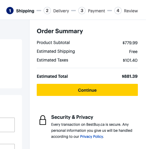
BEFORE: The checkout process allows you to continue to the next step but there is no way to exit and cancel the checkout transaction.
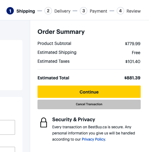
AFTER: A ‘Cancel Transaction’ button is now present to exit the checkout process.
Error Prevention
Field Inputs Error Messaging
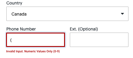
AFTER: Proper error messaging is provided to inform users of incorrect inputs
No Confirmation for Removing Item from Cart

BEFORE: Clicking the ‘Remove’ link for a product in your cart will remove the item right away without confirmation.

AFTER: After clicking ‘Remove’, a confirmation message appears asking the user whether they want to remove the item from your cart.
Flexibility and Efficiency Use
Separated Checkout Options
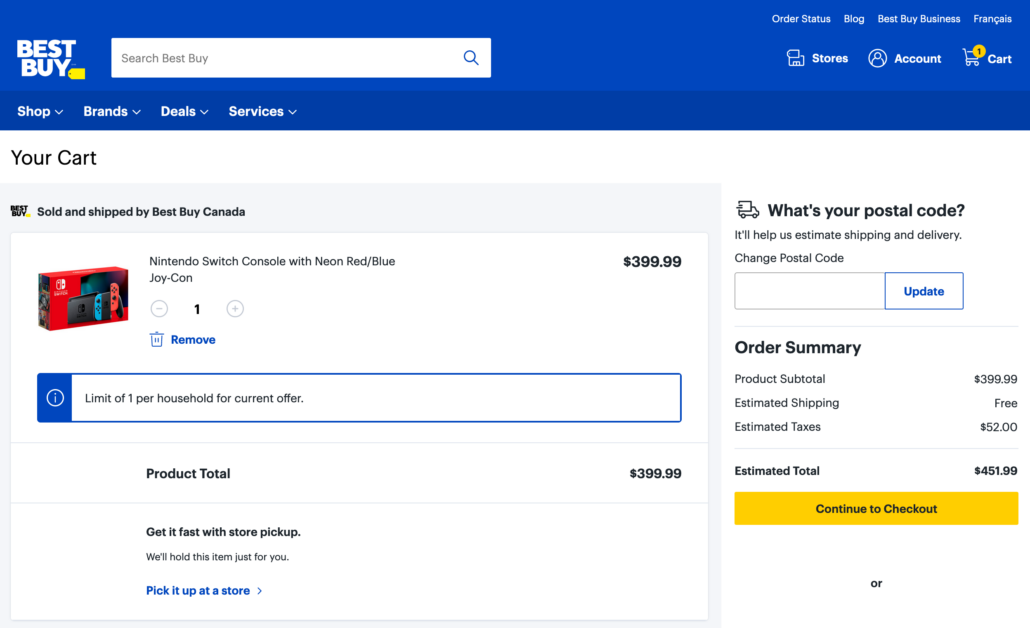
The checkout process is separate depending on your delivery method.
For in-store pick up, the checkout process is done by clicking the ‘Pick it up at the store’ link. For delivery, the checkout process is done by clicking the ‘Continue to checkout’ button.
Usability Study
The goal of the usability study is to analyze the usability of the Best Buy Canada website by allowing users to freely explore the system to obtain a conceptual model of the system and completing a set of predetermined tasks. The study was conducted as an online interview with two individuals who use e-commerce sites regularly. The usability study was split into two parts:
- Conceptual Model Study – Allows participants to navigate the website freely and provide their understanding of the page’s purpose and the displayed components
- Task-Based Usability Test – Participants are asked to complete a set of five tasks featuring different parts of the site including searching for an item, checking out and finding certain information on the site. The tasks were chosen based on the site’s primary goals and purpose, as well as actions commonly found and associated with e-commerce websites.
Following the conclusion of the tests, an exit interview was conducted to ask participants about their overall experience, their likes/dislikes, and to clarify their actions and responses from the testing session.
Usability Test Tasks
The tasks were chosen based on the site’s primary goals and purpose, as well as actions commonly found and associated with e-commerce websites. Some of the tasks given to participants include:
Overall Testing Results
Participants found the site to be easy and intuitive to use. The Best Buy Canada website has displayed strengths and weaknesses across the system. A strength found is that the overall site meet their purpose and goals, which is to allow users to find an item or browse freely for a product and make the purchase if they desire. However, this brings forth a weakness where the steps to complete the task is more than other e-commerce sites such as Amazon; this may cause users to utilize another site other than Best Buy. Another weakness that is displayed is the complex and non-uniform navigation. To reach a specific product, participants traversed many layers of navigation to view a product or listing category. Furthermore, participants had difficultly with the checkout process where they were unable to cancel the transaction if they desire and error checking and messaging is not prominent when using their checkout system.
Suggested Improvements
Based on the analysis conducted in the heuristic evaluation and feedback received by participants in the usability study, below are a few suggested improvements for the system to help improve the site’s design. The suggestion improvements mentioned are similar to the suggested solutions mentioned in the heuristics evaluation.
Conclusion
The Best Buy Canada website allows users to fulfill their searching and purchasing goals, however, it lacked many design implementations that would allow for an intuitive user experience. Although the flaws can be avoided by experienced technology-inclined users and users who often use e-commerce stores, new users may encounter difficulties with its navigation and content, which may result in frustration and information overload. Recommendations of improvement to the site to help improve user experience includes: simplifying the flow and information, unifying similar experiences such as the checkout options and providing a consistent, uniform navigation to deliver a simple and smooth user experience.
