UofTea
UX, Web Development
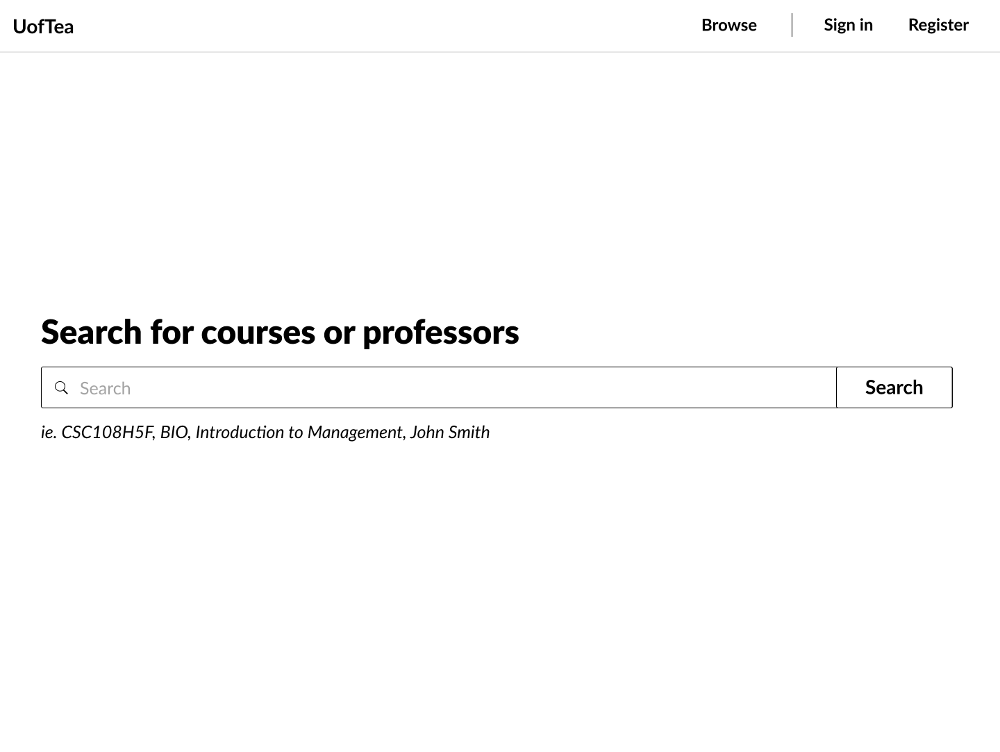
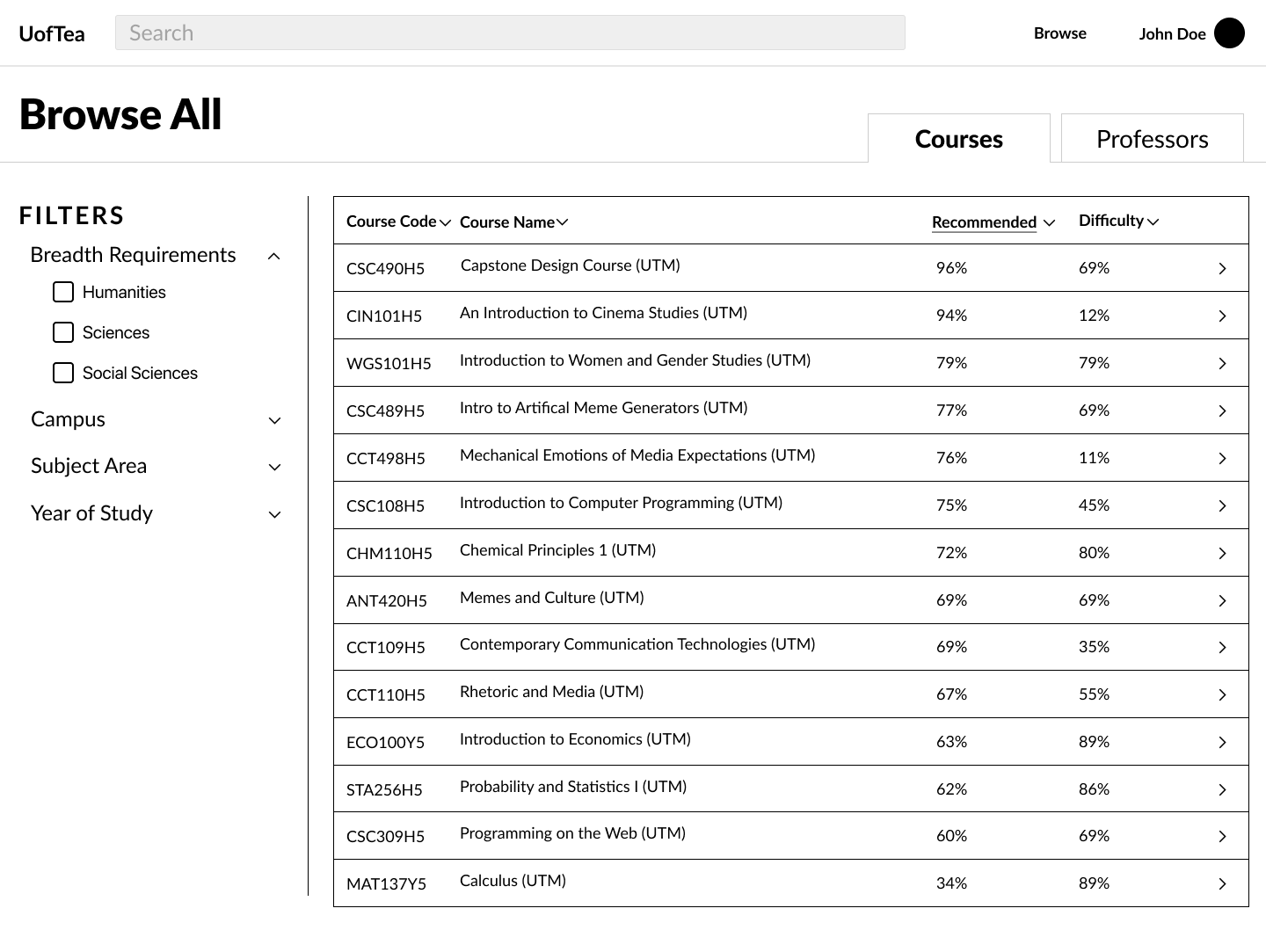
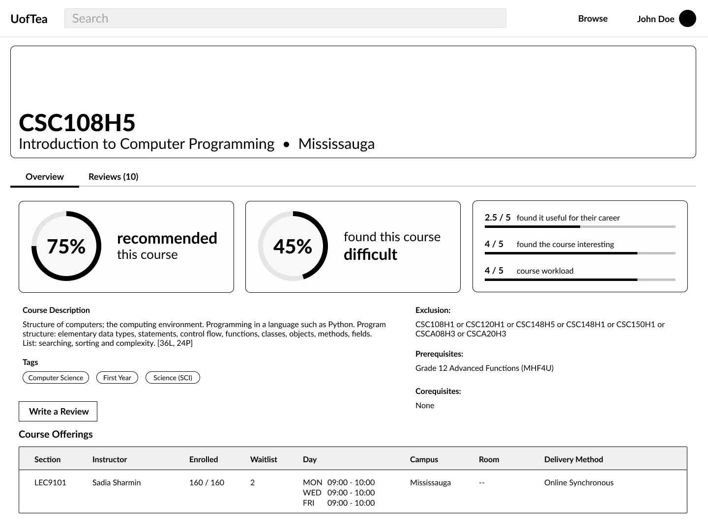
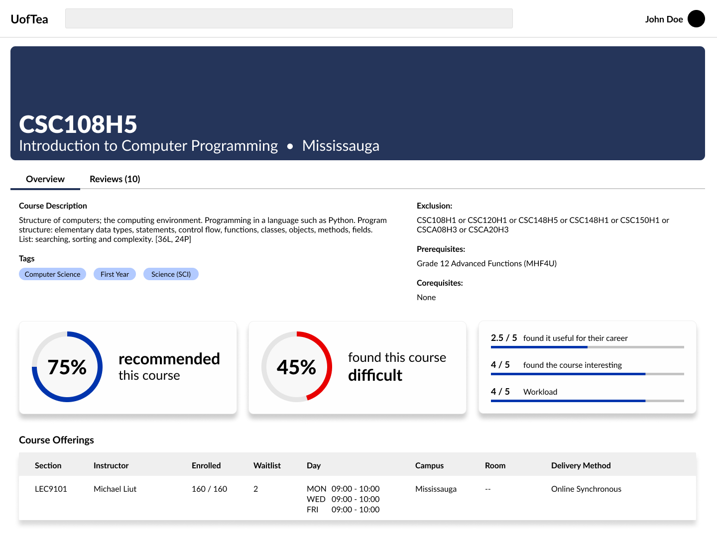
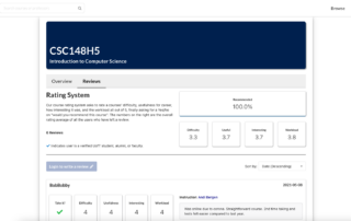
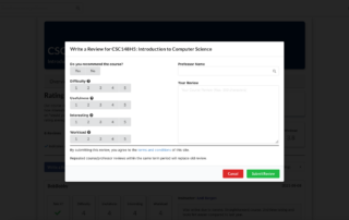
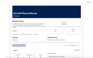
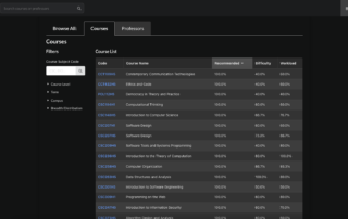
UofTea is a web application that provides users a platform to contribute and access informative student feedback on courses and professors at the University of Toronto. The application allows students to search for courses to retrieve updated course information, prerequisites and schedules, as well as create an account to view and create reviews for a course or professor. This project was created as part of a four-month Capstone Project course with a focus on user experience design and web accessibility. The primary goal of the capstone project was to create a software that was device-friendly, conforms to web accessibility principles and follows usability design principles.
Role
UX Designer
Frontend Developer
Team Members
Jonathan Ho
Lukasz Dworakowski
Daniel Salazar
Lance Santiago
Jessica Ly
Resources Used
HTML/CSS
React
Typescript
PostgresSQL/MongoDB
Node.js
Timeline
4 months
(September 2020 – December 2020)
The Problem
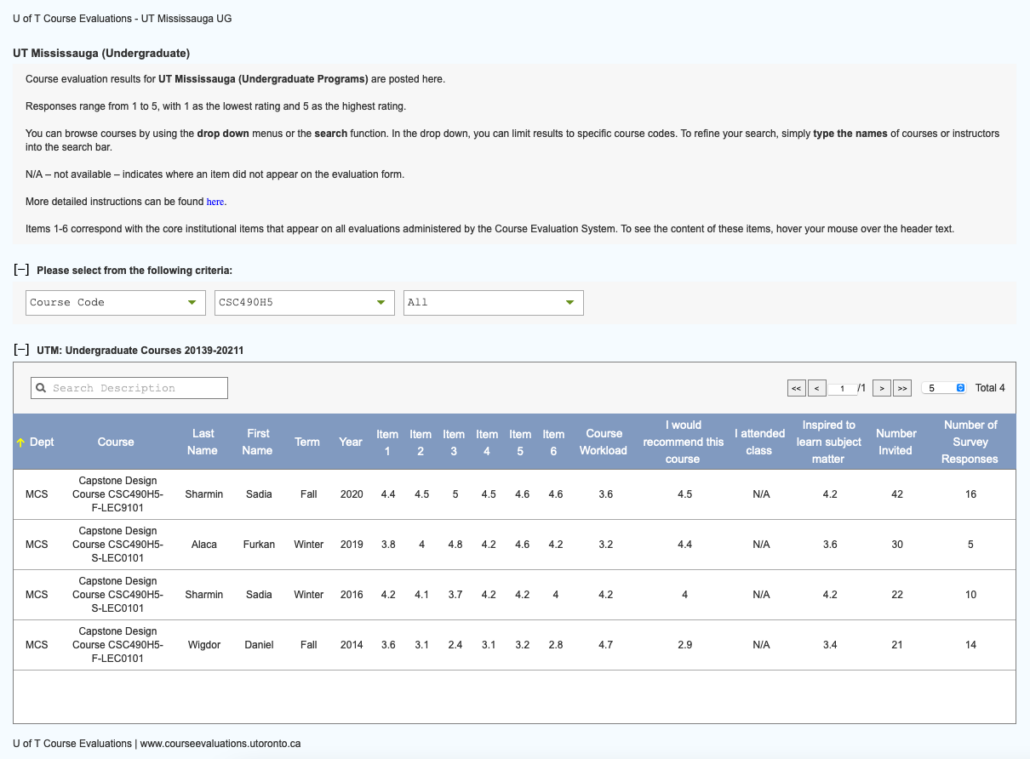
One problem UofT students face is a lack of access to realistic and meaningful student course feedback. Students may feel pressured to take specific courses because their peers express their importance. Many students do not really know what a course specifically teaches or anything about the professors before deciding to enroll. In addition, course descriptions are typically vague and course evaluations have abstracted student feedback by representing them as vague numbers. We aim to fix this problem by providing a platform for more accurate students course reviews.
Research
An online survey was conducted with a small group of students studying at the University of Toronto, asking questions regarding issues with the current course and professor evaluation systems used by the university and third-party competitions.
We noticed that most students do look at professor information and course information prior to taking their courses, but do so using various sites. Most students also complained negative feelings towards the university-owned system stating one of the reasons being their feedback was not heard by the university. Some students also did not realize that the course evaluations were accessible to them. They felt that the course evaluation website is inaccurate due to survivorship bias and that many students who complete them have extreme experiences (good or bad), and thus not useful for themselves.
Pain Points Uncovered
From our research, we have uncovered the following pain points,
Solution and Early Designs
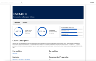
The team wanted to develop an all-in-one solution that allows users to view course information and course and professor reviews without the need of using multiple websites and services. Our core user goals are:
- Ability to search, and view reviews, as well as easy to understand ratings, for professors, courses, as well professor-course combination
- Ability for students to leave reviews and ratings for professors and courses
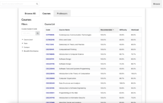
- Ability to easily navigate, search, and find current course offerings and their course information (professors, sections, requirements, etc)
Early Wireframe/Low-Fidelity Designs
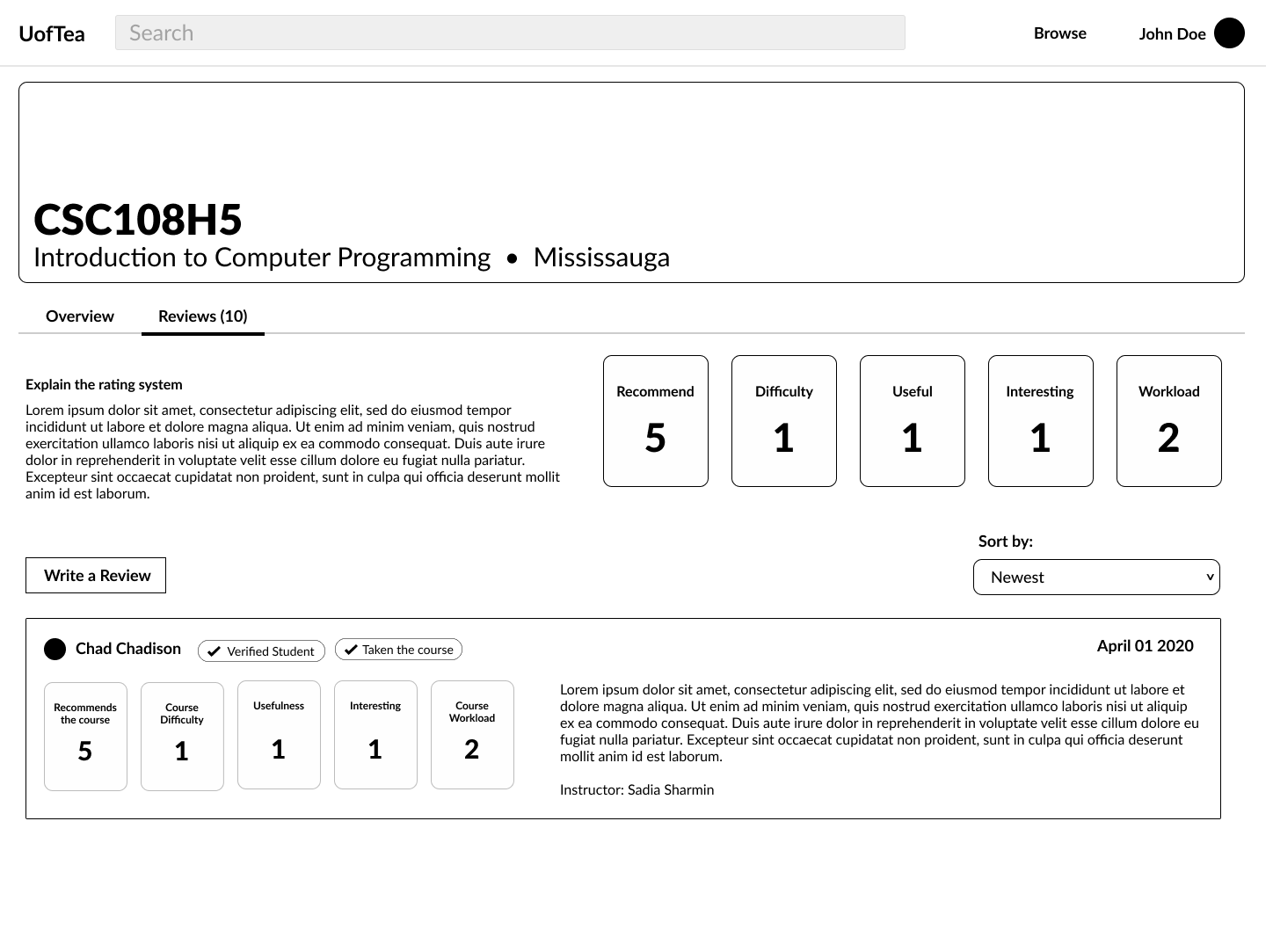
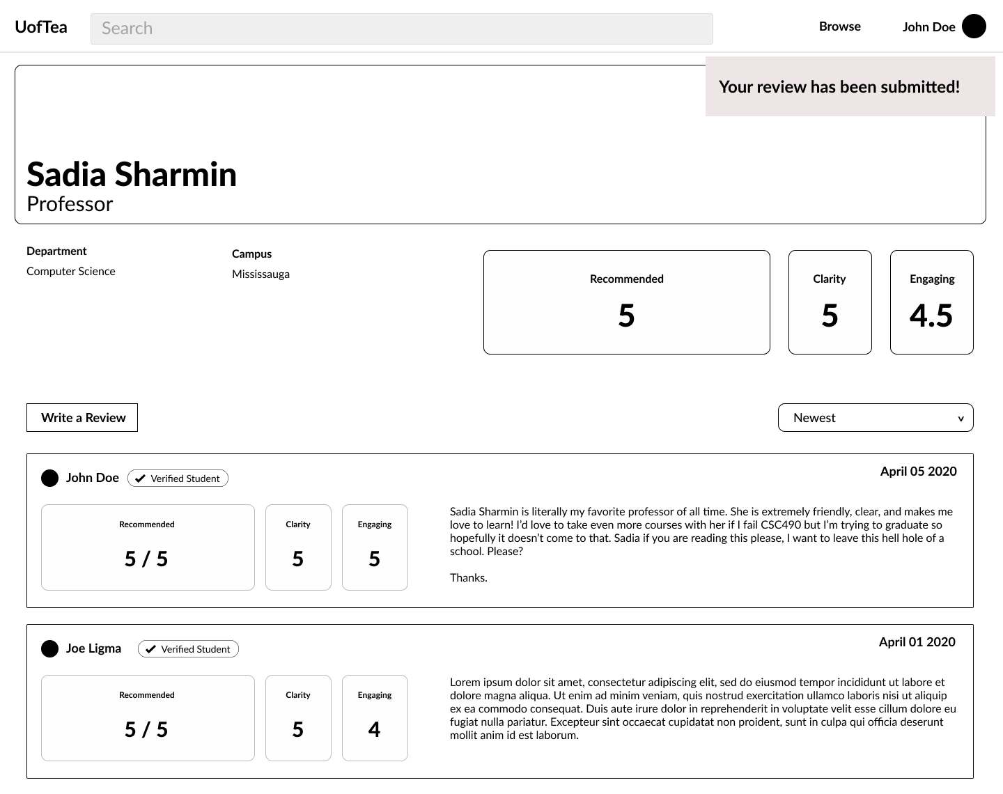
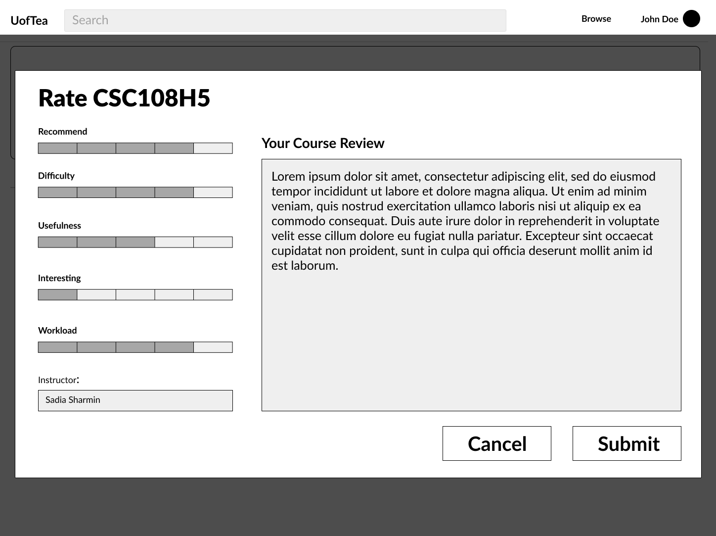
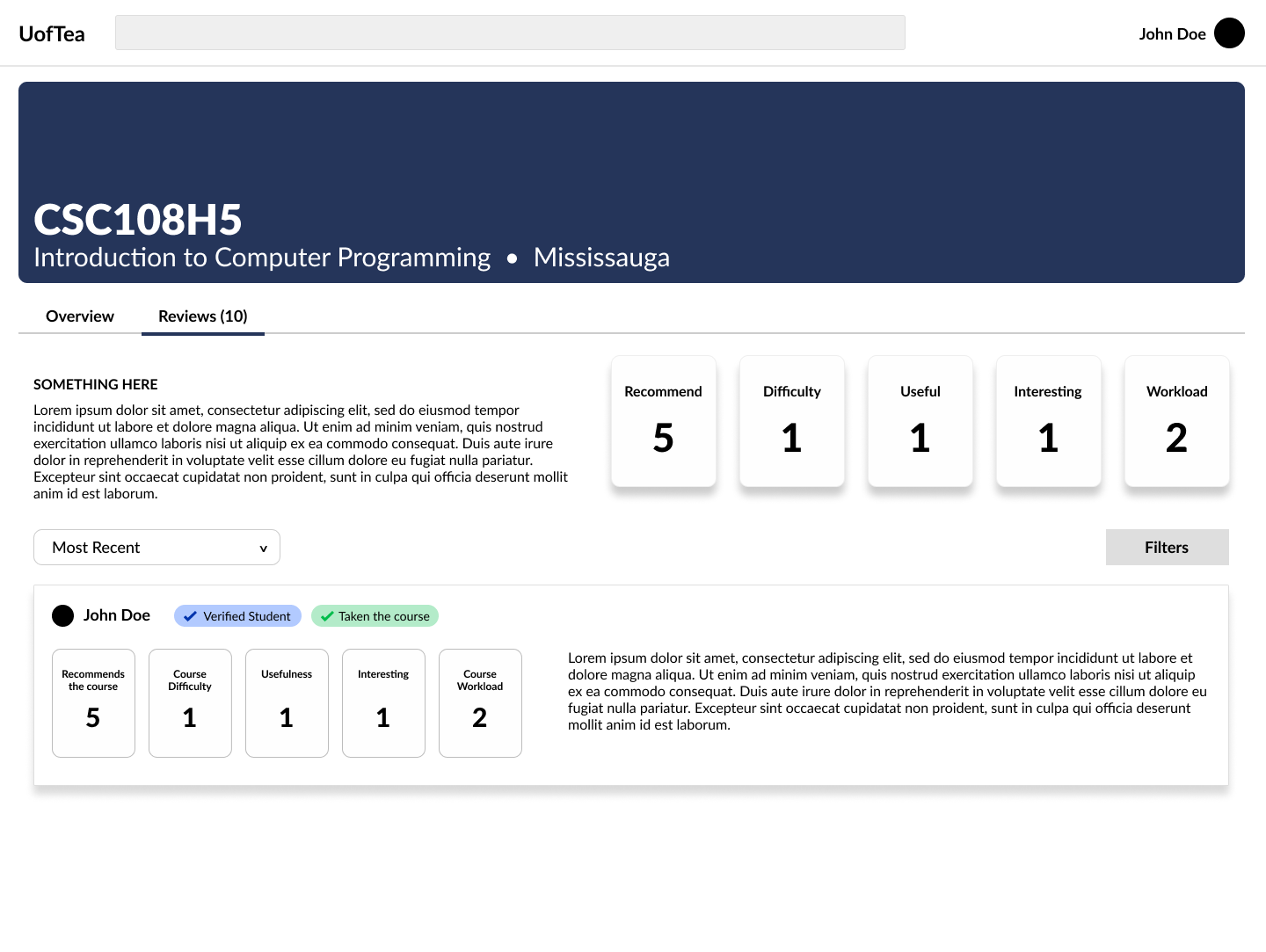
We used Figma to collaboratively create our wireframes and low-fidelity designs. We also conducted a usability testing session on our low-fidelity designs to ensure it meets users standards and needs, and addresses the concerns found in the user research study.
Final High-Fidelity Designs
Development
Development of the site was completed over a span of 6 weeks consisting of 3 two-week sprints.
Our tech stack…
Successes and Challenges
Things that work out…
We had a few aspects that stood out to us while working on the project that greatly benefited our production.
Things that did not work out…
Even though we have deployed a fully functioning web application, we had a few challenges when developing the application.

