PRESTO Card Mobile App Case Study
UI/UX, Visual Design
This project presents a preliminary user experience analysis of Metrolinx’s PRESTO Card mobile application based on personal experiences. Additionally, the project also focuses on the redesigning the app’s interface to improve its usability and include features that other users mention were missing or had issues with upon its initial beta version launch.
Role
UX Designer
Resources Used
Sketch
Adobe Illustrator
Timeline
3 Weeks
(Dec 2018 – Jan 2019)
References:
Introduction
PRESTO Card is a NFC (Near-Field Communication) contactless card system, managed by Metrolinx, used for fare payments on most public transit agencies in Ontario, Canada. In December 2018, Metrolinx released the official beta mobile app for the PRESTO Card. The app allowed users to check/reload their card(s), receive reminders, and view their transaction history. However, based on personal experience, as well as comments from other users, there were a couple key features and design components that were missing or could be designed better to improve the app’s functionality and usability.
Design Findings
Live Information Updates
Card information displayed in the app is based on your most recent transit usage or transaction. Although it makes sense to show the balance as of the most recent transaction, there is no way to refresh the content to see the most up-to-date information to determine if any changes or updates were recently made. Typically, users prefer viewing the most up-to-date information based on the time when the user interacts with the app. Additionally, recent transactions that are still processing or are pending are not shown (ie. fare payments) until at least 24 hours following the event.
Multi-Directional Screen Scrolling Home Page
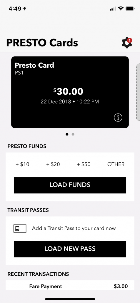
The home screen user interface is split into two sections with different directional scrolling.
- On the top half where the cards are displayed, users are able to scroll horizontally to view the cards.
- On the bottom half, users are able to scroll vertically to view card information and options. When you first view the app, limited affordance is provided.
With two different interaction methods to view additional information, it may cause some accessibility issues and difficulties for users when interacting and scanning the screen for information.
Pay For Transit Using The App
Based on my findings (viewing user-created PRESTO card apps, social media posts, and various online polls), one of the most requested features is the ability to pay for transit using the mobile app. Although Metrolinx planned this feature according to the PRESTO Card mobile app roadmap, it is not present in the beta version.
UPDATE (2021): The feature is currently being implemented using NFC technology.
Native/Web-App User Interface
The app utilizes aspects of a native app and web app, but do not work coherently. This results in slower-than-expected performance when operating the application, especially for offline use, and reduces the design consistency of the application. Some of the key
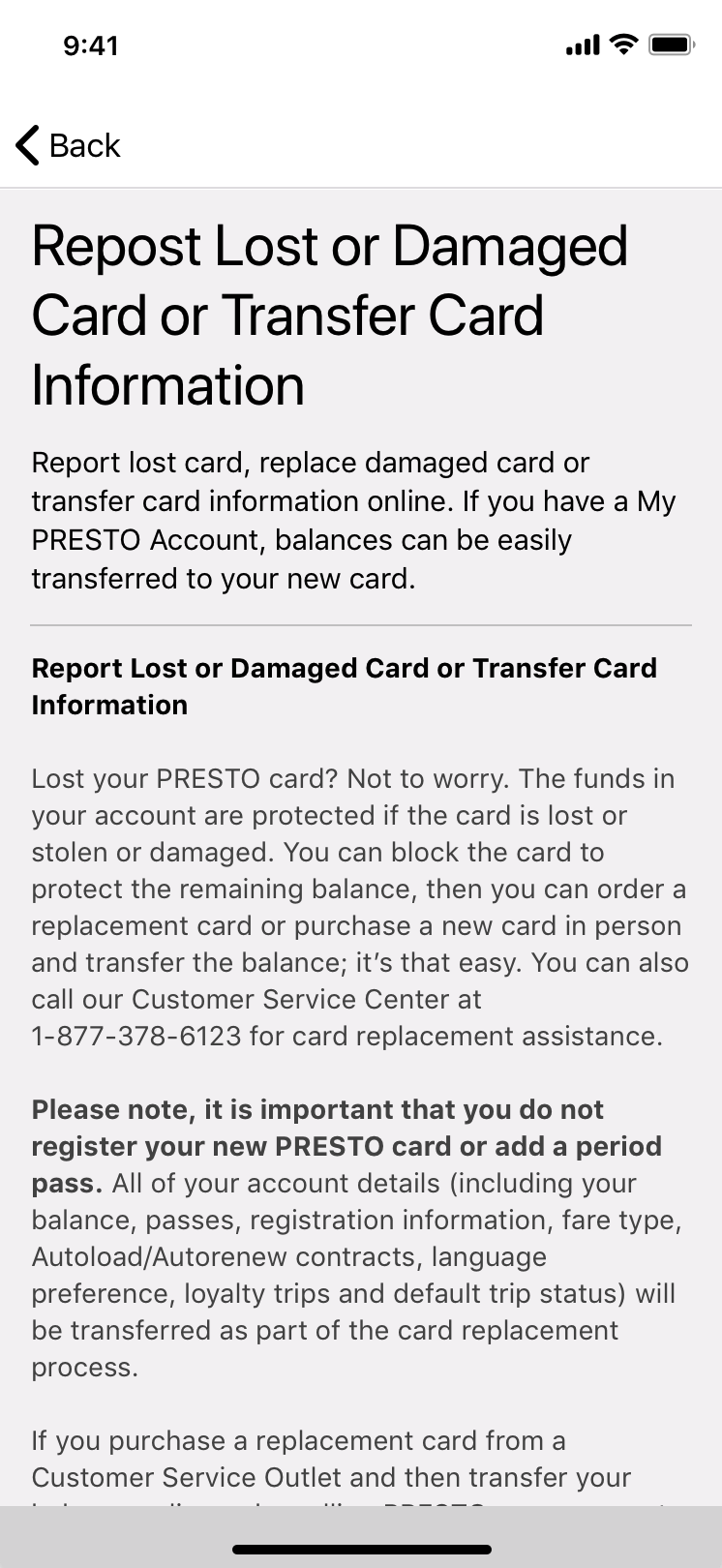
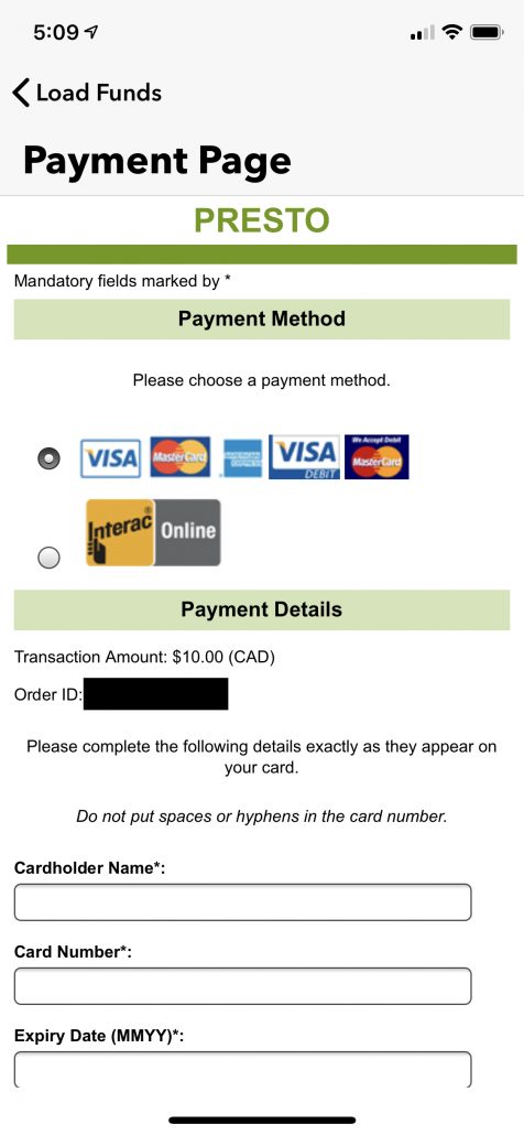
- Some of the links direct users to the PRESTO Card website or a third-party website using either an in-app browser and an external browser. Doing this creates an inconsistent usage flow, as it is evident to the user that the page is not entirely integrated as part of the app. Additionally, the inconsistency also makes the users feel disconnected with the app itself, and may find it difficult to navigate between the app and browser pages.
- For some functions that redirect one to the PRESTO Card website, an additional login is required to proceed. This is redundant as the user has already logged in using the app itself.
User Interface Redesign
After using the beta version mobile app on an iPhone device, there were features and design components that I believe were missing and could be designed better.
Better Organization of Content
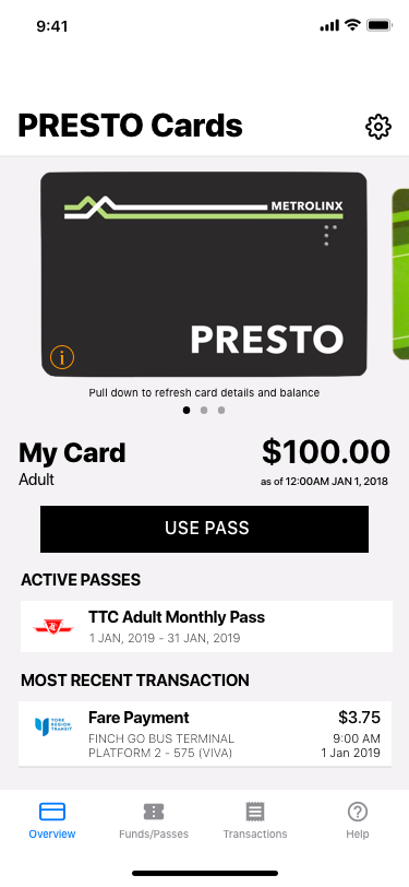
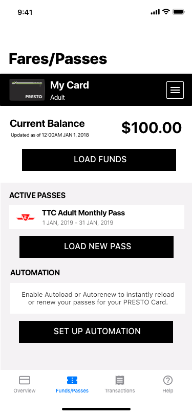
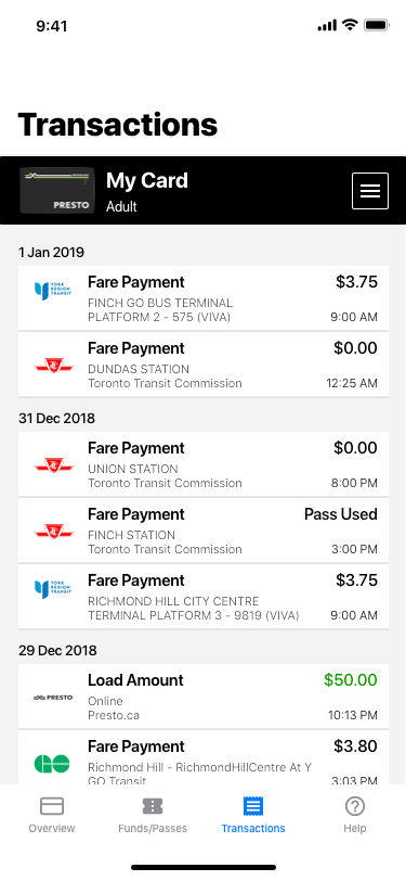
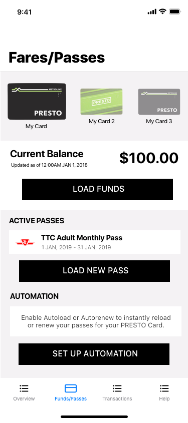
- Each block of information (fares/passes and transactions) are now placed on a new screen for better organization and decluttering of the home screen.
- Screens can be accessed using the tab menu bar located at the bottom.
- The most relevant information about the user’s PRESTO Card are shown on the home screen (current balance, active passes, most recent transaction).
Singular Scroll on Home Screen
- Only the horizontal scrolling for card selection remains on the home screen to avoid possible confusion on how to use the interface.
- To adjust for smaller-screened devices, the card listing area will decrease in height to provide efficient room for relevant information.
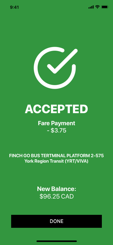
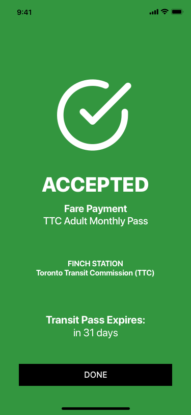
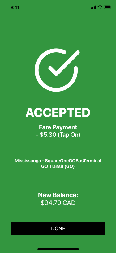
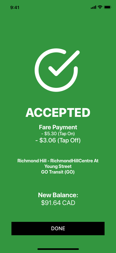
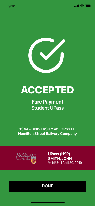
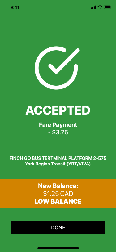
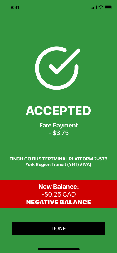
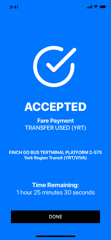
Pay Using the App
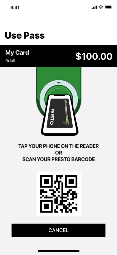
As this feature is currently not present in the beta version, I designed a user interface for said feature.
- Based on my interface design, the app will use NFC (by having the users tap the machine using the device similar to Apple/Google Pay) to make a fare payment.
- For devices that do not support NFC such as older iPhones and some Android devices, a mobile QR is also included to enable the option to scan to pay.
- This feature will work in offline mode and will process pay as soon as the app has reconnected to web services (similar to Apple/Google Pay).
- An animated image is provided to show users how to use the PRESTO card terminal with the app.
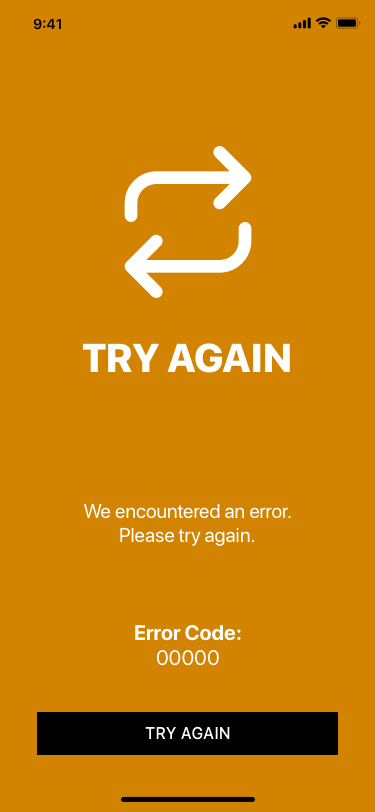
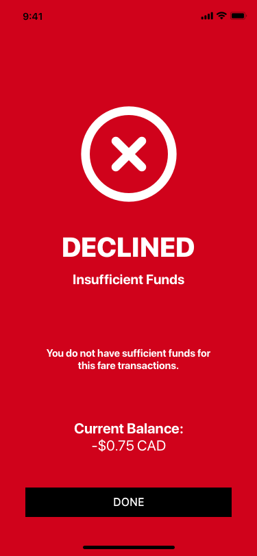
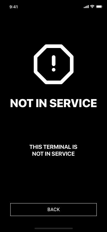
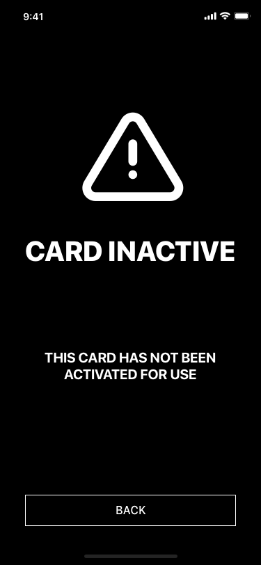
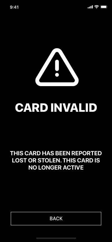
- After scanning or tapping the device for fare payment, one of the four messages (w/ slight variations) will appear: Accepted, Try Again, Declined or Others (ie. Card Inactive, Terminal Not in Service etc.)
All Native-App Design
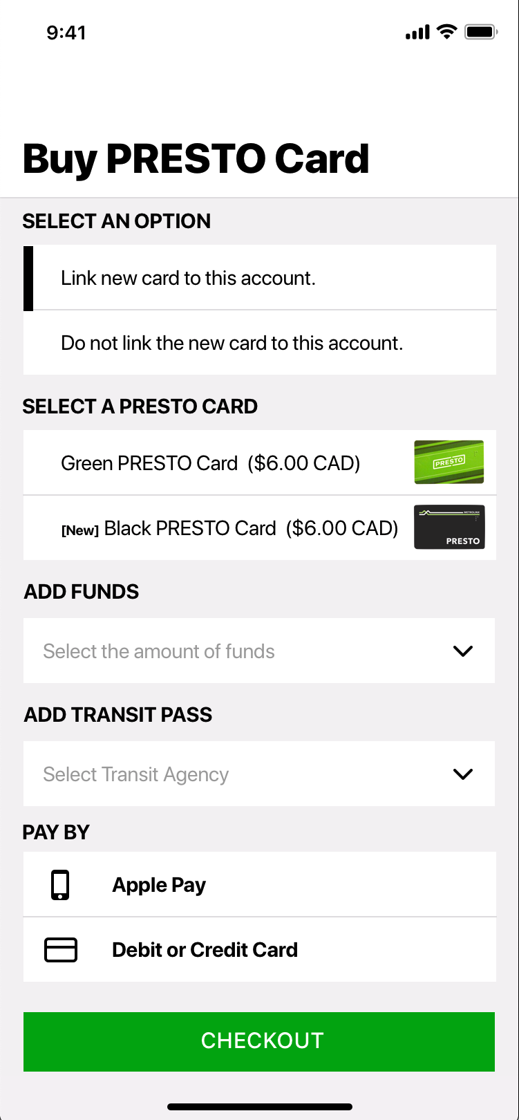
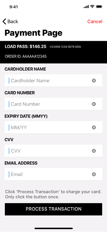
- Keep the design clean and consistent by creating a user interface for screens that utilize the in-app web browser or external web browser
- Make the new user interface look more uniform with the app’s overall design.
- By making the app all native and consistent, it is more likely to please users by conforming to the app’s usability requirements (easy to learn and use, familiarity and consistency of design, clear and concise user experience).
Switching Cards
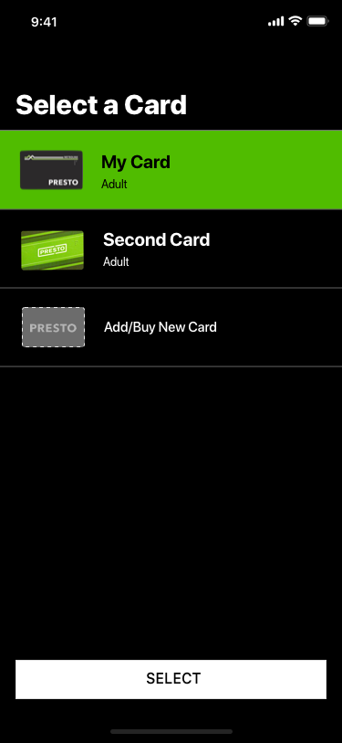
When separating the content using multiple pages, one concern was the ability to quickly switch cards without having to go back to the home screen.
- Option 1: Have a smaller carousel slider (similar to home screen). The selected card will be slightly larger than the other cards.
- Option 2: Add a small heading to indicate the card selected and a menu bar to allow users to select the card on an overlay menu.
As this is a content-focused mobile application, option 2 to provides more screen space for the content to address the issue found in the original design. This option also benefits smaller-screen devices as well especially if the headings and title bars have a fixed position.
Other Potential Features
This project is meant to analyze the user interface and user experience of Metrolinx’s PRESTO card beta app and redesign aspects of the original design with the exception of the fare payment feature. Although there were other features I wanted to include in this redesign project, I decided not to go forward with it in order to pay more attention to the fare payment option and any exciting elements of the current mobile app. I have included a list of potential features that could be great for the mobile application.

